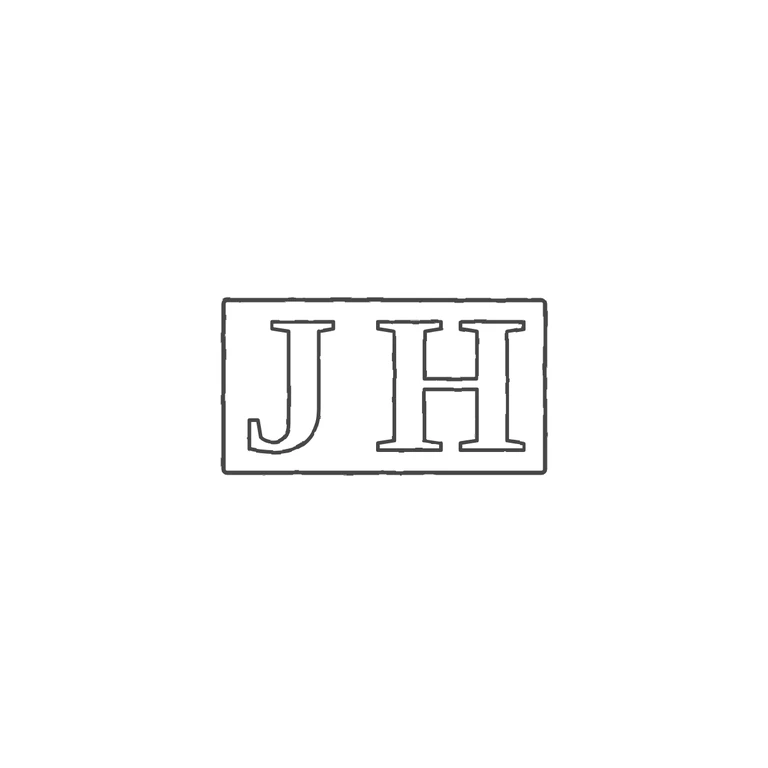
 Line
Mark variant 1
Low confidence comparison reconstruction.
Source is a small, low-resolution photo of a struck rectangular punch with the serif roman capitals J and H, upright and read left to right. The darker edges of the recessed field show the rectangular punch outline. There is a clear gap between the letters, and no stop, pellet or device appears in it or between the letters and the frame. The drawing shows one rectangle with slightly rounded corners around serif roman outline capitals J and H. The J has a hooked tail that sits slightly lower, and the H has a crossbar a little above the middle. Both match the source in letterform, order and spacing. Grey line work has the same weight throughout, on a clean white background, centred with a generous margin. Caveat: the source is very small, so faint details such as a tiny stop cannot be fully ruled out, but none is visible. Struck mark with two bold serif capitals J and H set side by side in a tight rectangular punch recess. The recess edge shows most clearly along the top and left. Revision 2: added one rectangular punch outline closely enclosing both letters, and moved the H closer to the J so the gap is about half a letter width. Letter forms, font and size are unchanged from round 1. I found no stops between the letters or between the letters and the frame.