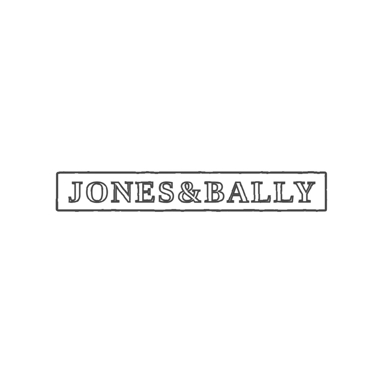
 Line
Mark variant 1
Low confidence comparison reconstruction.
Source-recorded mark text: Jones & Bally
Source is a small, low-resolution photo of a long rectangular punch with incuse roman serif capitals reading JONES & BALLY on one horizontal line. I found no stops in the gaps between letters or between the letters and the frame, but the small image means a faint pellet can't be fully ruled out. The drawing shows a single rectangular frame with outlined roman serif capitals JONES&BALLY in the same order and orientation. The ampersand sits a little tighter to its neighbours than in the source, which is within tolerance. Long narrow rectangular punch (about 7: 1) with a single border line around it. Inside is one line of bold serif roman capitals, evenly spaced across the full width: J O N E S, then an ampersand, then B A L L Y. I could not see any stops in the gaps between letters or between the letters and the border.