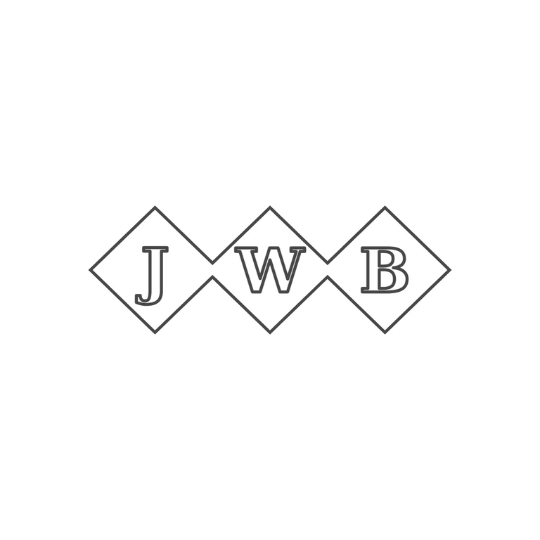
 Line
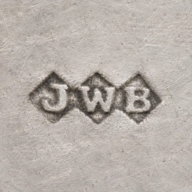 AI oxidized
Drag to compare L lineO oxidized
Mark variant 1
Low confidence comparison reconstruction.
Source: a single punch made of three joined lozenges (diamonds) in a horizontal row. Each holds one serif roman capital, J, W, B, read left to right. I checked the gaps between letters and between the letters and the outline and found no stops, pellets or devices. Drawing: the same outline of three joined lozenges with the matching points where they meet, and the same serif roman capitals J, W, B in outline, one in each lozenge, upright and in the same order. There is. The photo texture is gone, the background is plain white and the line weight is the same throughout. The mark sits in the centre with wide white margins on every side. The letters fill their lozenges a little less than in the source, but the letterforms and layout still match. Struck mark with three conjoined lozenge (diamond) punches side by side, each holding one bold serif capital: J, W, B. A single outline follows the joined lozenge punch. No stops between letters or between letters and border. Revision 2: removed the feTurbulence/feDisplacementMap wobble filter, which caused the stray dash fragments outside the lozenge edges and the doubled/offset strokes inside the letters. Each lozenge is now one clean stroke, and letters and frame share one 7 px outline weight. Geometry, letters, font and placement are unchanged.

