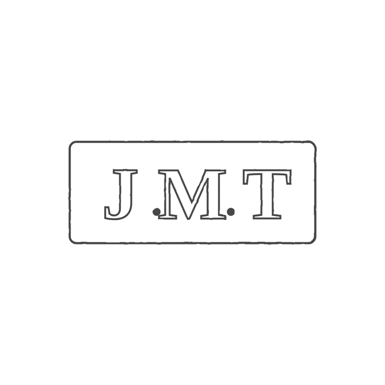
 Line
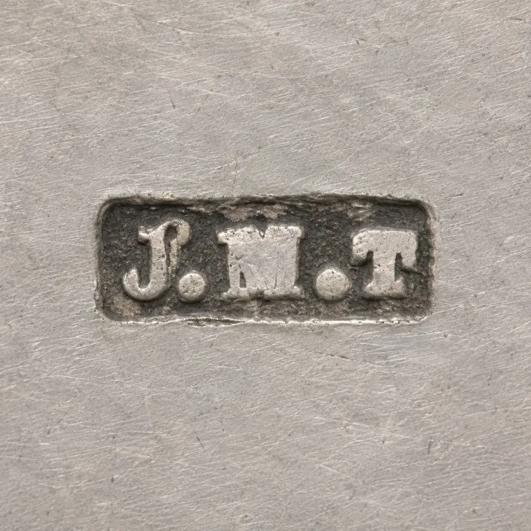 AI oxidized
Drag to compare L lineO oxidized
Mark variant 1
Low confidence comparison reconstruction.
Source: a single rectangular punch with slightly rounded corners holding heavy serif capitals J, M, T, with a solid stop in each gap (J.M.T). Drawing: one rounded-rectangle frame, outlined serif capitals J M T, and two solid stops in the same gaps. The glyph lists are identical, the letterforms are the same family (bold serif roman), the frame shape matches, the background is plain white and the mark sits centred with a generous margin. Minor note, not blocking: the drawn stops sit low and tight against the M, while in the low-resolution source they look more evenly centred in each gap. That's worth adjusting if the stops are refined later. Single struck mark in a horizontal rectangular punch with slightly rounded corners. Three bold serif capitals J, M, T read left to right, with a solid stop in each gap between them, set a little below mid-height. Letters appear light (raised) on a dark recessed ground; drawn as outlined bold serif glyphs inside a single-line rectangular border.