 Line
Mark variant 1
Low confidence comparison reconstruction.
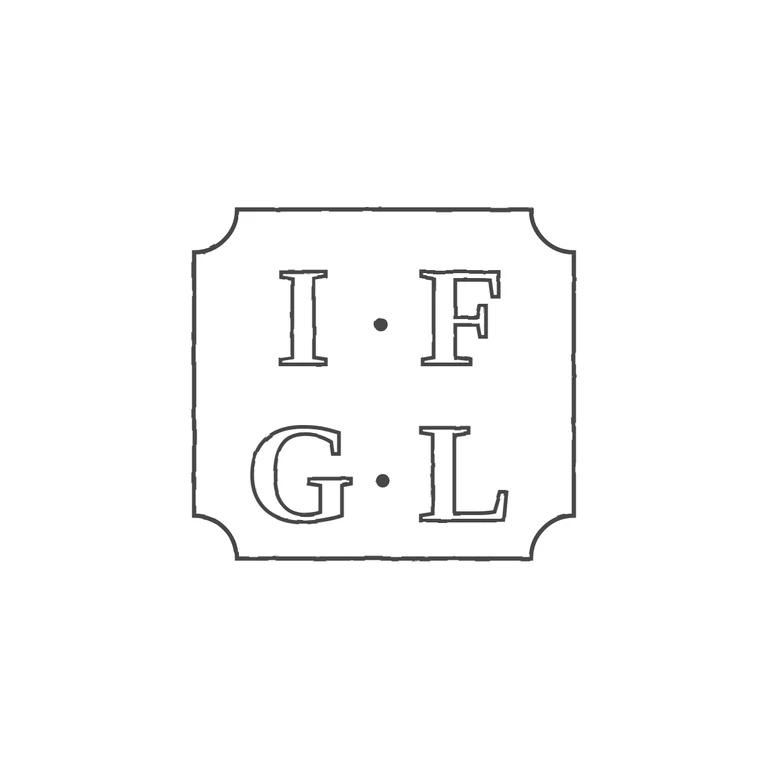
The source is a small, low-resolution photo of a two-line roman-capital mark, I F above G L, in a near-square punch with concave (incurved) cut corners. Small pellets seem to sit at mid-height between I and F and between G and L. The upper one is fairly clear. The lower one is less certain at this resolution, but it fits the spacing and the symmetry of the punch. The drawing matches: I·F / G·L in roman serif capitals, centred mid-height pellets, a single outline with concave corners on all four sides, the same orientation and reading order. It uses one consistent outline stroke on a white background, and the mark is centred with a generous margin. Single struck mark: a square cartouche with concave (inward-notched) corners, giving a quatrefoil-like outline. Two rows of bold roman serif capitals: 'I·F' above 'G·L', with a small stop between the letters of each row. Drawn as one outline with outlined bold serif glyphs and solid dots for the stops.