 Line
Mark variant 1
Low confidence comparison reconstruction.
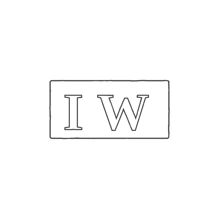
Source is a small rectangular punch (corners slightly softened) holding two serif roman capitals, I then W, upright and reading left to right. The first letter has symmetric top and bottom serifs and no hook, so it is I, not J. No stops, pellets or devices are visible in the gaps between the letters or between the letters and the border. The drawing shows one rectangular frame with slightly rounded corners around outlined serif capitals I and W, in the same order and orientation. Minor stylistic differences, not counted as failures: the gap between I and W is somewhat wider in the drawing than in the source, and the W's central apex sits a little lower than it seems to in the low-resolution source. Neither changes the letter identity or style. Small struck punch: bold serif capitals I and W in a plain rectangular cartouche with slightly softened corners, about 2: 1 wide. The I is narrow at the left; the wide W takes up most of the right part of the field. I saw no stop between the letters or at the edges.