 Line
Mark variant 1
Low confidence comparison reconstruction.
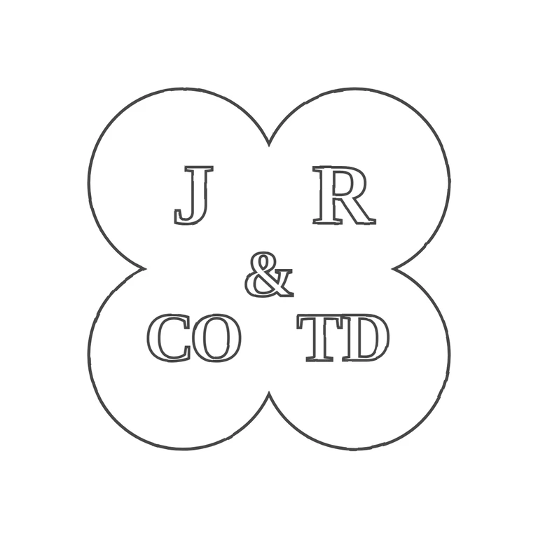
Source is a quatrefoil (four-lobed) punch with J in the upper-left lobe, R in the upper-right, & in the centre, CO in the lower-left and TD in the lower-right. The letters are serif roman capitals and no stops are visible in any gap. The lower-right group reads as T D in the photo. The small curl at the top-left of the T may be a worn L ligature (the maker name is LTD), but it was not counted as a separate letter because it is not clearly visible. The drawing has the same quatrefoil outline with the same lobe proportions, the same glyphs in the same positions and similar serif letterforms. It uses a uniform outline stroke on white, no photo texture is left, and the mark is centred with an adequate white margin. Single quatrefoil punch (four round lobes) with one outline. Bold serif capitals: J (upper left lobe), R (upper right lobe), an ampersand in the centre, CO (lower left lobe) and TD (lower right lobe). No stops are clearly visible between the letters or between the letters and the border.