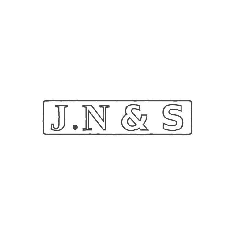
 Line
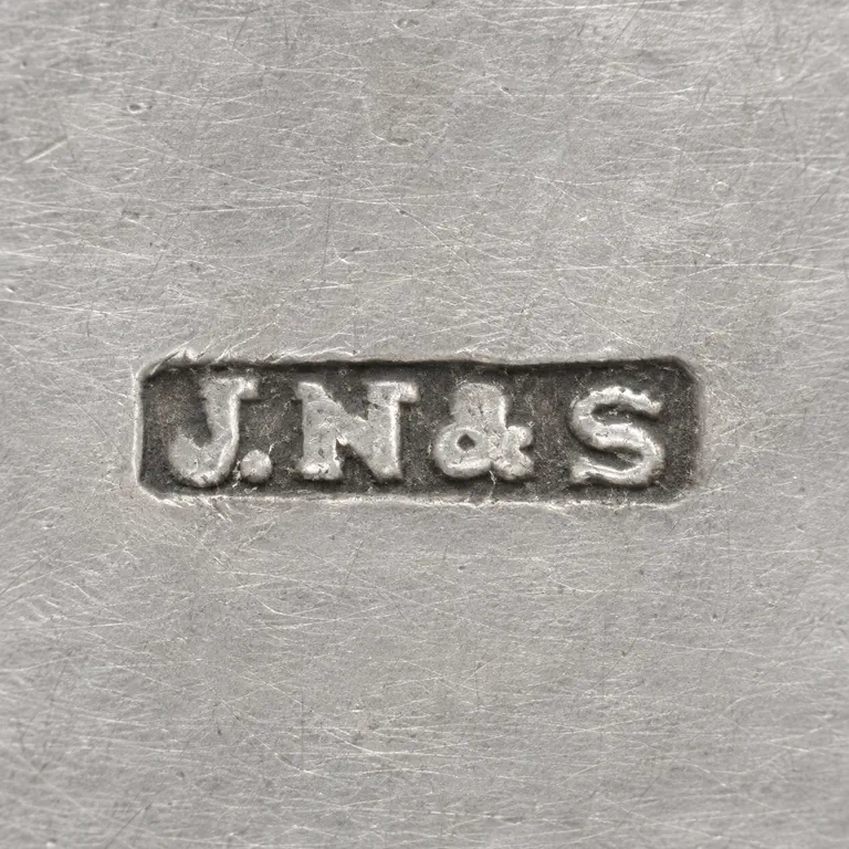 AI oxidized
Drag to compare L lineO oxidized
Mark variant 1
Low confidence comparison reconstruction.
Source is a single rectangular punch with slightly rounded corners, reading J. N & S in one line, upright and left-to-right. The solid stop between J and N sits low, near the baseline. There are no other stops between N, &, S or next to the border. The drawing shows the same rounded rectangle frame and the same five symbols in the same order: outlined J and N with small serifs, a solid baseline stop, an outlined ampersand and a broad outlined S. The weight and proportions match the low-resolution source closely enough. The line weight is consistent, the photographic texture is gone, the background is white, and the mark is centred with a generous margin. Single rectangular punch with slightly rounded corners holding J.N&S in heavy capitals on one line, with a solid stop on the baseline between J and N. Revision 2: J and N are now set in a bold serif face, so they have small serifs (J top, N feet), and the J sits on the common baseline with N, & and S instead of dropping below it. The & and S stay in bold sans, as in r1. Ampersand and S are scaled to match the serif cap height. Letters are enlarged and tightly fitted. The frame is shortened in width and height so the group J.N&S is centred with narrow, roughly equal end margins, as in the source.