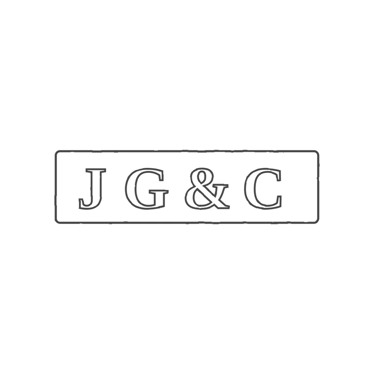
 Line
Mark variant 1
Low confidence comparison reconstruction.
Source: a single rectangular punch with slightly rounded corners holding bold serif capitals J G & C. No stops or pellets in the gaps between the letters or between the letters and the frame. Drawing: one rounded-rectangle outline of similar proportions holding outlined serif J G & C in the same order and orientation, with nothing added. The photo background is fully removed, the background is white, the line weight is uniform, and the mark is centred with a wide margin. Minor differences that don't fail any rubric item: the letters are spaced more widely than the tightly packed source lettering, and the group sits a little left of centre inside the frame (more empty space after C than before J). Single struck mark in an oblong rectangular punch with slightly softened corners. Bold roman serif capitals J and G, then an ampersand, then C, evenly spaced across the punch and nearly filling its height. I saw no stops in the gaps between letters or between the letters and the border.