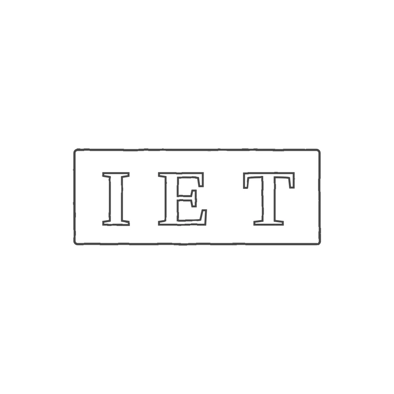
 Line
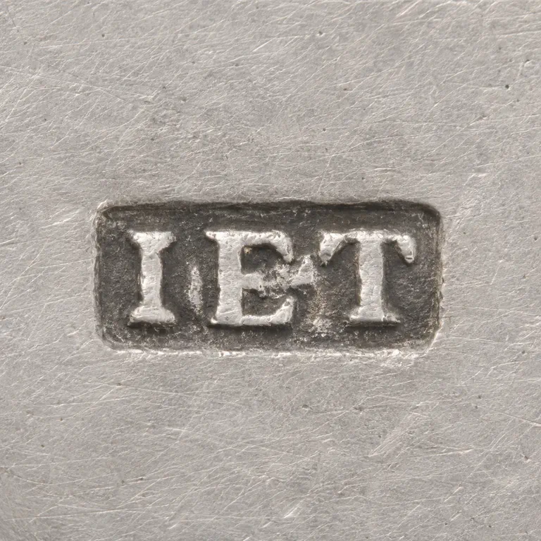 AI oxidized
Drag to compare L lineO oxidized
Mark variant 1
Low confidence comparison reconstruction.
The source is a small, low-resolution photo of a rectangular punch with slightly rounded corners. Inside are three serif roman capitals, I E T, with no visible stops in the gaps; the slight smudge near the foot of the E looks like its serif or wear. The drawing has the same rectangular frame and three outlined serif capitals I E T in the same order and orientation, drawn with one even line weight on a white background. The mark is centred with a wide margin. Small differences: the drawing's letters are spaced more widely than the source's tightly packed letters, and the gap between E and T is a little larger. Neither difference changes the content. Small low-resolution reproduction of a rectangular punch with slightly rounded corners, about 2.6: 1, showing three heavy serif capitals reading I E T (light letters on a dark field). The first letter reads as a plain I with serifs, with no visible J descender. The gap between E and T is wider than the gap between I and E. Drawn as a single rounded-rectangle outline with outlined bold serif letters, keeping the uneven spacing.


