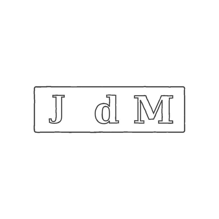
 Line
Mark variant 1
Low confidence comparison reconstruction.
Source: a small, slightly round-cornered rectangular punch holding three characters in one line: a capital J, a lowercase d (round bowl on the left, tall stem on the right), and a capital M. There are no stops or pellets in the gaps between the letters or between the letters and the frame. Drawing: one round-cornered rectangular outline with outlined serif J, d and M in the same order, the right way up and reading left to right. The background is plain white, the line weight is the same throughout, and the mark sits in the centre with a wide margin. The letters are evenly spaced, as in the source; the J–d gap is only a little wider than d–M. The source is too worn and small to make out the serif detail, but the drawn forms fit its proportions. No content has been added. Single rectangular punch with slightly rounded corners containing three bold glyphs on one baseline: capital J, a lowercase d (round bowl with tall ascender on the right, reaching close to cap height), and capital M. Revision 3: removed the spurious 'c' (the middle glyph is a single 'd'); enlarged the d so its ascender is about as tall as J and M; raised and resized the J so it sits on the common baseline with the same height as M; respaced J, d and M roughly evenly across the punch. No stops visible between letters or between letters and border.