 Line
 AI oxidized
Drag to compare L lineO oxidized
Mark variant 1
Low confidence comparison reconstruction.
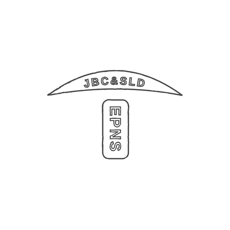
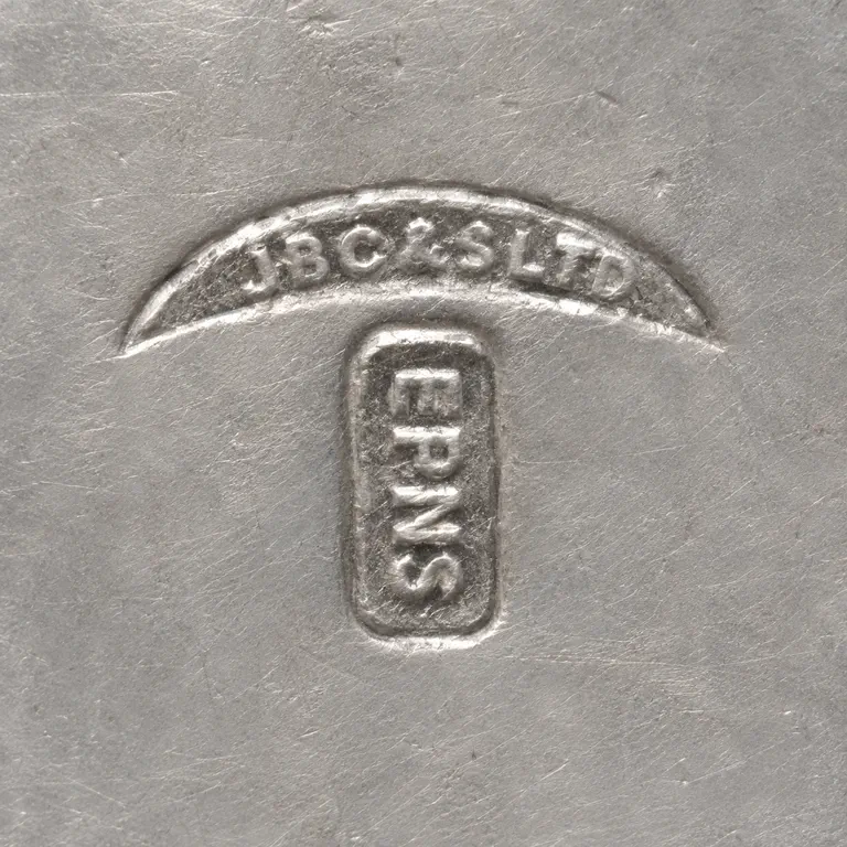
The source is a small, low-resolution photo of two punches. The first is a crescent banner reading JBC&SLD along its upper arc. Below it, centred, is an upright rounded rectangle with EPNS running vertically from top to bottom. I could not resolve any stops between the letters in either punch, and the drawing has none. Both frame shapes, their placement and proportions, the reading directions, and the plain sans-serif capitals, drawn as outlined letters. It correctly leaves out the '925-1000.com' watermark and the metal texture. It has a clean white background, a consistent grey stroke and a centred layout with wide margins. The crescent's lower edge is a little flatter than in the source, but the punch shape is still clearly the same. The source is a small reproduction (it carries a website watermark) showing two struck punches. Upper: a crescent or arched band punch with sans-serif capitals 'JBC&SLD' set along a gentle upward arc. Lower: a vertical rounded-rectangle punch, slightly right of centre, with 'EPNS' in bold sans capitals rotated 90 degrees and reading top to bottom. Both are drawn in their source positions. The second punch's border is listed as a second 'border: yes' token before its letters.


