 Line
Mark variant 1
Low confidence comparison reconstruction.
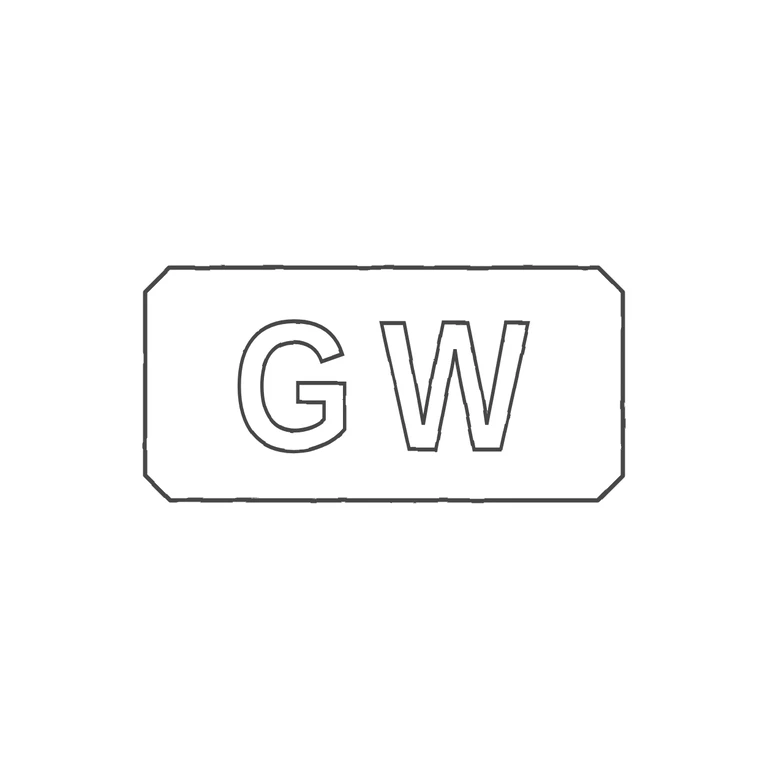
Source: a small, low-resolution photo of an incuse mark. It shows sans-serif capitals G W inside one horizontal rectangular punch with clipped corners. The first letter has an inward spur at the lower right, so it reads as G. I found no stops, pellets or devices in the gaps between the letters or between the letters and the border. Drawing: the same rectangular punch with canted corners, drawn as one outline, and outlined sans-serif G and W in the same order and orientation content. The background is plain white, the lines are a uniform grey outline, and the mark is centred with a wide margin. The G's crossbar is a little more pronounced than the source shows clearly, but it is still the same letter and letter style. Oblong punch with clipped (canted) corners, a single outline. It holds two plain sans-serif capitals, G and W, standing apart with a clear gap and centred as a pair in the punch. No stops or devices are visible. Revision 2: the letters are narrowed (horizontal scale 0.85) and slightly smaller, with a clear ~55 px gap between them so the outlines no longer cross. The pair is centred horizontally on the punch centre (x≈627), and each letter is drawn as a single clean outline.