 Line
Mark variant 1
Low confidence comparison reconstruction.
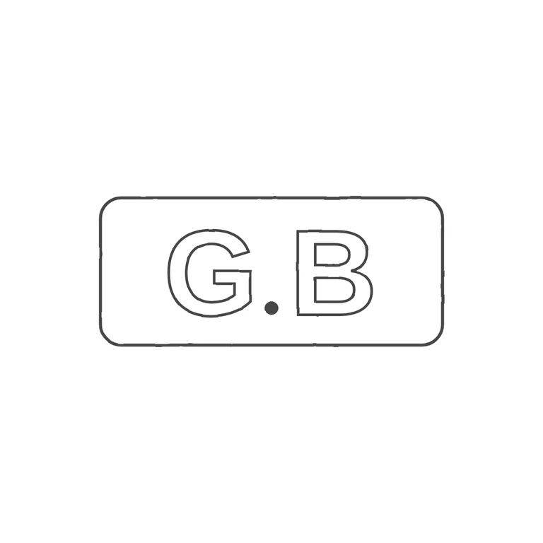
Source: a single wide rectangular punch with rounded corners holding the sans-serif capitals G and B, with a solid stop between them sitting low near the baseline. The source photo is very small. The dark areas at its far left and right ends look like the punch's rounded ends and wear, not separate pellets, so I did not count them as stops. Drawing: one rounded-rectangle outline, outlined sans-serif G and B, and a solid stop at the baseline between them. Same orientation, order and letterforms, nothing added. Clean white background with a uniform line weight, and the mark is centred with generous margins. Small struck mark: a single rounded-rectangle punch outline (about 2.3: 1 wide) enclosing the raised capitals G and B, with a solid stop at the baseline between them. The letters are heavy, plain capitals with little or no visible serif. Drawn as one rounded-rectangle line with outlined bold sans capitals and one solid dot.