 Line
Mark variant 1
Low confidence comparison reconstruction.
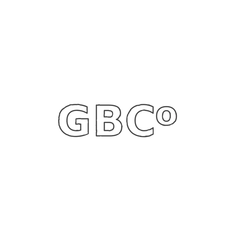
Source is a low-resolution raised/struck sans-serif mark reading G B C followed by a small raised (superscript) o, i.e. a 'Co' style abbreviation; no punch outline is visible around the letters and no stops are visible in the gaps or under the raised o. The drawing reproduces G, B, C and a smaller raised o in the same order, upright, left to right, as consistent single-weight outline lettering in a sans-serif style matching the source, on a clean white background with the mark centred and a generous margin. No frame, stops or extra content added. The raised o is drawn slightly smaller and more cleanly than the somewhat elongated source form, but it is the same kind and position of glyph. Raised (relief) heavy rounded sans-serif capitals G B C in a single horizontal line on a flat metal strip, followed by a smaller raised lower-case o set high, top-aligned with the capitals (superscript style). No punch outline or border line is distinguishable around the letters. No stops seen in the gaps.