 Line
Mark variant 1
Low confidence comparison reconstruction.
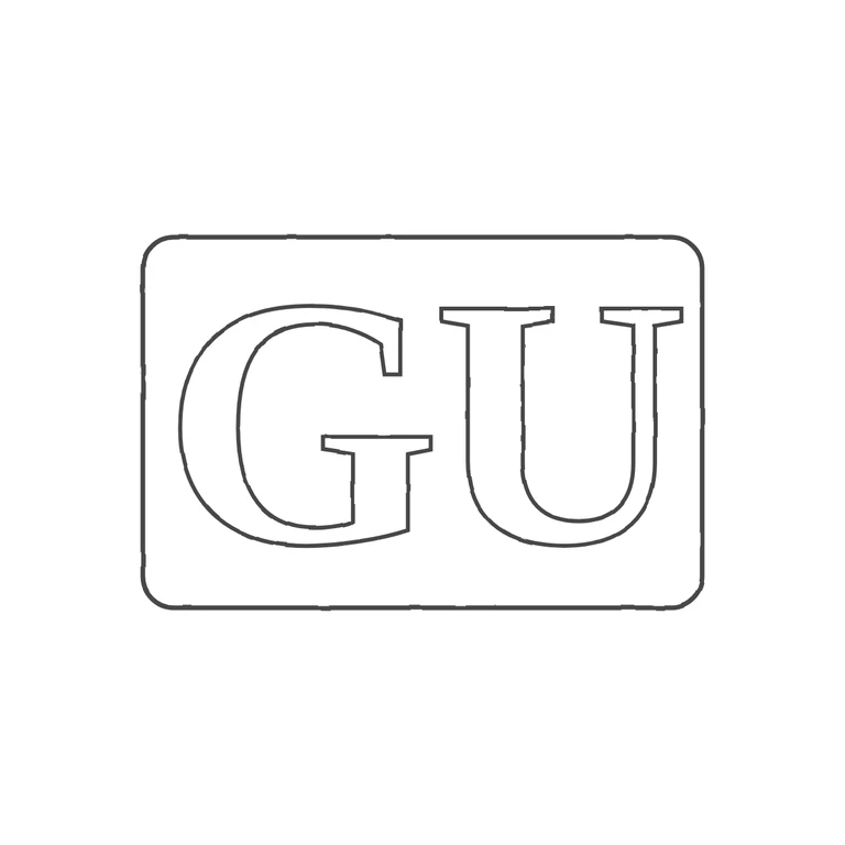
The source photo is a strip of hallmarks: the maker's punch 'GU', then a lion passant, a sovereign's head, a gothic date letter and an anchor, plus a '(c)925-1000.com' watermark. The assignment is for the maker (George Unite), so I judged the maker's punch alone. That punch is a rectangle with softened corners holding two upright roman serif capitals, G then U. I saw no stops between the letters or between the letters and the frame. The drawing shows one rounded-rectangle outline with outlined roman serif 'GU', upright and reading left to right. Minor note: the source punch looks somewhat wider than the drawn frame (about 2: 1 against 1.5: 1), but the thumbnail is too small to measure reliably, and the punch shape is clearly the same kind. If the target was meant to be the whole hallmark strip, the drawing leaves out the lion passant, head, date letter and anchor punches. The source is a hallmark strip of five punches: (1) a maker's mark reading 'GU' in bold roman serif capitals in a rectangular punch with rounded corners, (2) lion passant, (3) sovereign's head duty mark, (4) a gothic date letter, (5) anchor. Only punch 1 is plain lettering and it is the conventional maker's-mark position, so only it is drawn. The letters were read from the photograph: a large serif G and U, wide and closely spaced and nearly filling the punch height. No stop is visible between or around the letters. The other four punches (pictorial devices and gothic lettering) are left out on purpose.