 Line
Mark variant 1
Low confidence comparison reconstruction.
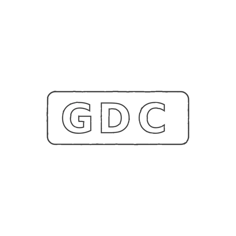
Source: a horizontal rectangular punch with rounded corners holding the upright sans-serif capitals G D C, with no stops or devices. The highlight inside the C is a reflection on the metal, not a glyph. Drawing: an outlined rounded rectangle around outlined sans-serif G D C in the same order and orientation, drawn with a uniform grey line on white. The proportions are close enough; the source C looks slightly rounder, which is acceptable. Single struck mark: three bold sans-serif capitals G D C in a horizontal rectangular punch with rounded corners, roughly 2.7: 1. No stops visible between letters or at the ends. Letters evenly spaced; the C sits slightly closer to the right edge of the punch.