 Line
Mark variant 1
Low confidence comparison reconstruction.
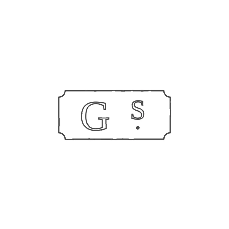
Source: a horizontal rectangular punch with concave (cut) corners. Inside it is a large serif roman capital G, then a smaller raised S with a small solid stop below it, the same arrangement as a superscript abbreviation. Drawing: the same punch with concave corners, a roman serif G, a raised smaller S and a solid stop beneath the S. The glyph order and orientation are the same. The drawing has a little more space between G and S, and the letters fill slightly less of the frame height than in the source. These are minor proportion differences and not errors. The background is white, the line weight is the same throughout, and the mark is centred with a generous margin. Small, low-resolution struck mark in a horizontal rectangular punch with incurved (concave) corners. A large serif capital G on the left; to its right a smaller capital S set high, with a small mark beneath it read as a stop. Drawn as outlined serif glyphs with a single border line following the punch outline.