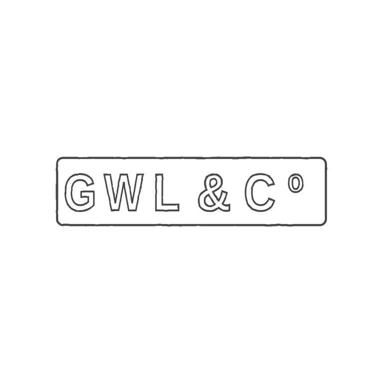
 Line
Mark variant 1
Low confidence comparison reconstruction.
Source: a single rectangular punch (about 4: 1, with slightly rounded corners) holding the sans-serif capitals G W L, an ampersand, a capital C and a small raised lowercase o (Co). The letters are struck in relief and show as outlines. I found no stops in any gap, including under the raised o. Drawing: a rounded rectangle at the same proportions with outlined sans-serif G W L & C and a small raised o. The order and orientation match, and nothing is missing or added. The drawing spaces the letters a little more widely than the source and leaves slightly more room after the o; this is a minor difference and does not need fixing. The background is pure white, the line weight is consistent, and the mark is centred with generous margins. Single struck mark in an elongated rectangular punch with slightly rounded corners (about 4: 1). Relief sans-serif capitals G W L, an ampersand, C, and a small raised lower-case o sitting high beside the C (Co abbreviation). Letters are bold and fairly condensed, closely spaced, nearly filling the punch height. Drawn as outlined bold sans glyphs, horizontally condensed per glyph to match source proportions, with a single rounded-rectangle border.
