 Line
Mark variant 1
Low confidence comparison reconstruction.
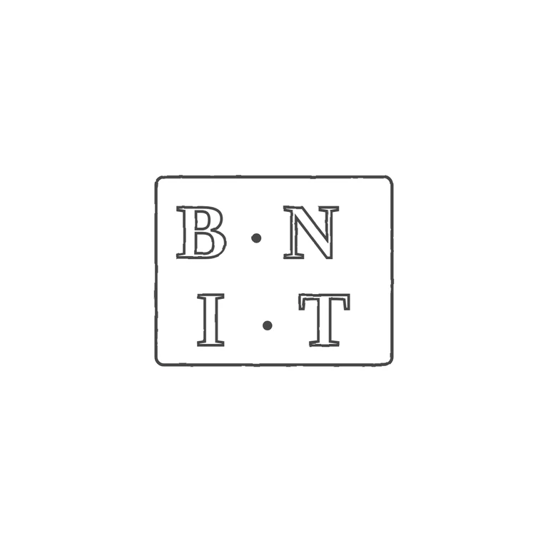
The source is a tightly cropped photo of a two-row punch: serif roman capitals B and N on the top row and I and T below, with a solid mid-height stop between each pair. The darker perimeter, most visible at the left corners and the right edge, reads as the edge of a rectangular punch, so the frame is recorded as border: yes. That is the least certain call, because the crop is tight. The drawing shows the same two rows, B. N over I. T, in outlined serif roman capitals with mid-height pellets, inside a single rectangle with slightly rounded corners. It is upright, on a clean white background, uses one even line weight, and sits centred with a generous margin. Nothing has been added or left out. Small rectangular punch struck with two rows of heavy roman serif capitals: 'B·N' above 'I·T', each pair separated by a mid-height solid stop. The lower row sits slightly right of the upper row. Dark punch edges are visible at left and right, which I read as a plain rectangular border; I drew it as a single slightly rounded rectangle.