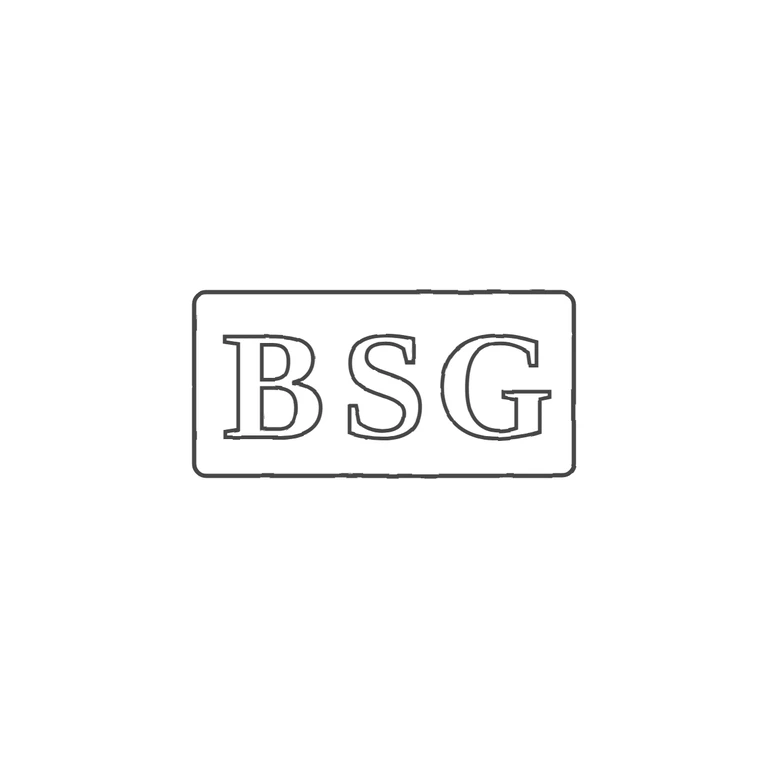
 Line
Mark variant 1
Low confidence comparison reconstruction.
Source is a small, low-resolution photo of a horizontal rectangular punch with slightly softened/canted corners, holding the incuse capitals B S G in a row. I saw no stops in the gaps between letters or between the letters and the frame. The drawing shows one rectangular frame with rounded corners and an aspect ratio close to the source (about 2.1: 1), with outlined roman capitals B S G in the same order and orientation. The source letters are plain roman capitals. They look a little squarer and heavier than the drawing's serifed forms, but not clearly a different style. There are no stops, devices or other added content. Background is white, line weight is uniform, and the mark is centred with a wide white margin. Single struck punch: a horizontal rectangular cartouche with slightly rounded corners enclosing three bold serif roman capitals B S G, evenly spaced and filling most of the punch height. No stops visible between letters or between letters and the border.