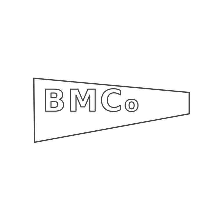
 Line
Mark variant 1
Low confidence comparison reconstruction.
Source: incuse pennant/tapered-trapezoid punch, tall on the left and narrowing to a short squared right end, with sans-serif capitals B M C followed by a smaller lowercase o, as in 'Co'. I saw no stops in the gaps between letters or between the letters and the frame. Drawing: the same tapered pennant outline with its tall left side and narrow right end, and outlined sans-serif B M C plus a smaller lowercase o on the same baseline. The letter sequence, the size relation between the capitals and the o, and the placement in the left part of the punch match the source. No stops added. Even line weight on a white ground. The mark is centred with a generous margin. Pennant-shaped punch: the tall left end is nearly vertical, the top edge runs almost level and drops only slightly to the right, and the bottom edge rises steeply to a narrow, square-cut right end. Bold block sans capitals B M C and a small lowercase o set beside the C, all on one baseline in the upper/middle part of the wide left section. The right half of the pennant is empty. Revision 2: the wobble filter that caused the doubled/dashed ghost lines is removed, so the outline and letter contours are now single clean strokes. The punch is reshaped to be asymmetric (level top, rising bottom). The letters are smaller and spaced with small gaps so none overlap, and they sit higher, with the o fully inside the outline. No stops are visible.