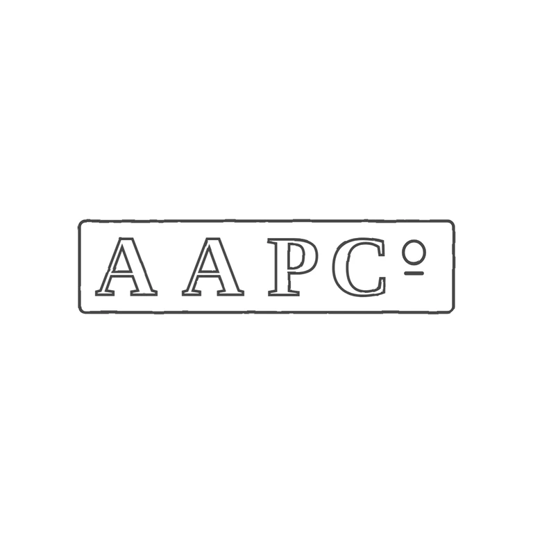
 Line
Mark variant 1
Low confidence comparison reconstruction.
Source: a single rectangular punch with slightly rounded corners holding the serif roman capitals A A P C, then a raised small superscript o with a short bar under it (the abbreviation C-superscript-o). I found no pellets or stops in the gaps between letters or between the letters and the frame. Drawing: an outline rectangle with rounded corners and the same serif roman A A P C, plus a superscript o with an underbar in the same position. Orientation, reading order, letter count and letterform style all match. The underbar under the o is part of the abbreviation, not a stop, and it appears in both images. The background is white, the line weight is consistent, and the mark is centred with a wide margin. Single oblong punch with slightly rounded corners, holding bold serif capitals A A P C with a superscript o after the C (the abbreviation 'Co'). The letters are widely spaced. Revision 2: the raised o is now a small, nearly round outlined o whose top lines up with the cap tops, to the right of the C. The short solid bar/stop directly beneath it, which the source shows, has been added. It is drawn as a short thick round-capped stroke because it is a short bar in the source rather than a round dot. Everything else is unchanged from r1.