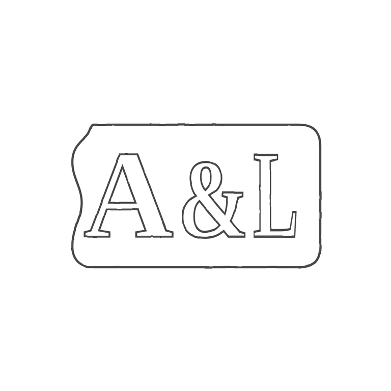
 Line
Mark variant 1
Low confidence comparison reconstruction.
Source is a small, low-resolution photo of a single incuse punch with seriffed roman capitals A & L. The punch is a rounded rectangle whose left edge is irregular and wavy (an indent at the upper left, a bulge lower down), and whose right side is straight with rounded corners. The last letter is small in the photo; its base runs out to the right of the stem, which reads as an L rather than an I. I found no stops in the gaps between the letters or between the letters and the border. The drawing has the same single outline with the same irregular left edge, and the same seriffed A, & and L in the same order, upright and reading left to right. The letters are drawn as even dark-grey outlines on pure white, with no photo texture left. The mark is centred, roughly 60% of the width, with a wide white margin all round. Nothing is added or missing. Struck mark: heavy serif capitals A & L in a single-line cartouche with a shaped, indented left end and rounded right corners; no stops in the gaps. Revision 2: the three characters are now spaced apart (A centred at x=412, a horizontally narrowed ampersand at x=684, L at x=885) so no outlines cross; the L is horizontally condensed (scale 0.55) so it is narrow, close to an I in width, with a shorter foot; the lettering was enlarged (A and L 330 to 400 px, so caps fill roughly 57% of the punch height instead of about 47%) to bring the inner vertical margins closer to the source. Punch outline unchanged.