 Line
Mark variant 1
Low confidence comparison reconstruction.
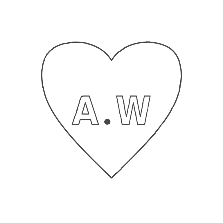
Source shows a heart-shaped punch containing bold sans-serif capitals A and W with a solid baseline stop between them, letters set slightly below the heart's centre. Drawing reproduces the single heart outline with matching proportions (rounded lobes, central notch, pointed base), outlined bold sans-serif A and W with a solid baseline stop between them, at a similar relative size and position. Upright, left-to-right. Heart-shaped punch containing bold sans-serif capitals A. W on one line, with a solid stop at the baseline between them. Revision 2: the heart has been redrawn broader and fuller. The lobes are wide and rounded, the sides bulge outward at letter height and then taper to a shorter bottom point. The lettering has been scaled down and centred in the lower-middle of the heart, so that A, the stop and W sit entirely inside the outline with clear space all round (about 60 px at the baseline on each side), as in the source. Letter forms, stop and font are otherwise unchanged from r1.