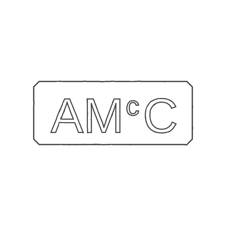
 Line
Mark variant 1
Low confidence comparison reconstruction.
Source: a single horizontal oblong punch with clipped/softened corners holding upright sans-serif capitals A, M, then a small raised lowercase c at cap-top height, then a full-height C. I looked in the gaps (A-M, below the raised c, C-border) and found no clear stop or underline; the low resolution of the source leaves a little doubt about the space under the small c, but nothing there reads as a deliberate pellet or bar. Drawing: same oblong frame with canted corners, outline-stroked sans capitals A M, superscript c, C, in the same order and proportions, upright and left-to-right. Uniform dark-grey outline on pure white, no photo texture, mark centred with wide white margin. Glyph lists match and all rubric items hold. Single struck oblong punch with slightly clipped corners, reading A M c C in plain sans-serif capitals; the small lower-case c of 'Mc' sits raised between M and the final C, its top level with the cap line. Letters are close-set, A and M nearly touching. Drawn as one chamfered rectangle outline with outlined glyphs.