 Line
 AI oxidized
Drag to compare L lineO oxidized
Mark variant 1
Low confidence comparison reconstruction.
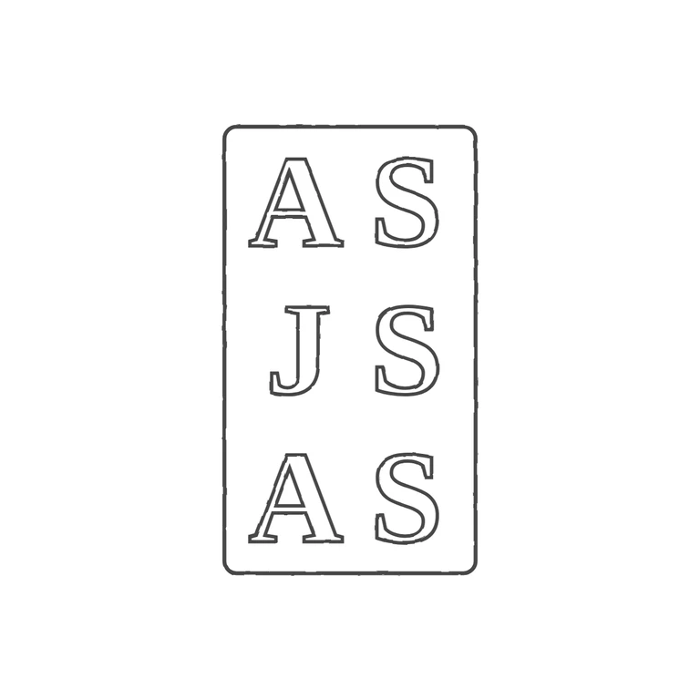
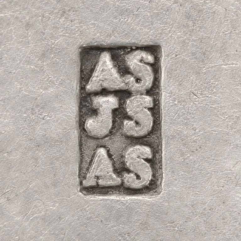
Source: upright, tall rectangular punch with slightly rounded corners holding three rows of serif roman capitals, AS / JS /. I looked for stops in the gaps between the letters, between the rows and between the letters and the frame, and found none. Drawing: the same upright, rounded-corner rectangle with the same three rows, AS / JS / AS, in outlined serif roman capitals. There are. The background is clean white, the line weight is consistent, and the mark is centred with a generous margin. A minor difference: the source letters are heavier and fill the punch more tightly than the drawn letters, but the letterforms are the same style and the reading is the same. Upright rectangular punch, roughly 1: 1.8 width to height, holding three stacked rows of bold roman serif capitals: 'AS' over 'JS' over 'AS'. The letters are large and crowded inside the punch, with little space between rows or against the border. The corners look slightly rounded. Drawn as one rounded-rectangle outline with six outlined bold serif capitals.