 Line
Mark variant 1
Low confidence comparison reconstruction.
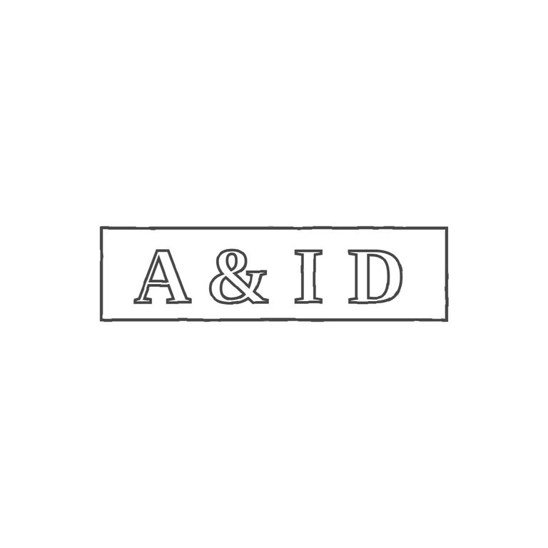
Source is a very small, worn photo of one rectangular punch, about 3.2: 1, holding four bold serif roman capitals in a row. They read A, an ampersand-like glyph, I, D. The second glyph is low-resolution and could just be an S, but its looped form fits & best. I found no stops or pellets in the gaps between letters or between the letters and the frame. The drawing shows one single-line rectangular frame, about 3.7: 1, with outlined serif capitals A & I D in the same order and upright. It has a white background, no photo texture, consistent stroke weight, and is centred with a generous margin. In the source the letters are larger and fill the frame more tightly than in the drawing. That is a proportion difference, not a change in content or frame shape. Small, dim photograph of a single struck rectangular punch on silver. It holds four bold roman serif characters in one line: A, an ampersand, I, D. The rectangle border is visible along the top, bottom and right edges. The letters fill most of the punch height. Drawn as a single rectangle with outlined bold serif glyphs, keeping the wide, low proportions (about 3.8: 1).