Note: We couldn’t find relevant auction comps in our database for this topic right now. If you’re valuing a specific item, try searching by maker/model/material and we’ll expand coverage over time.
What similar items actually sold for
To help ground this guide in real market activity, here are recent example auction comps from Appraisily’s internal database. These matched sales are market context only, not an object estimate or identification, and they do not guarantee a price for your specific a print made by reliable newark of soiree.
Shown USD range: USD 275-USD 5,000. Median of these 3 USD examples: USD 600.
| Comparable | What sold | Auction house | Date | Lot | Source-reported amount |
|---|---|---|---|---|---|
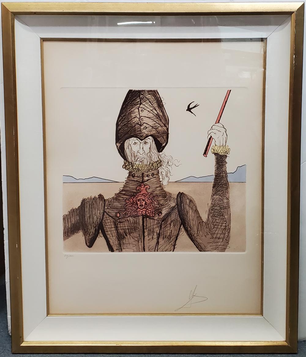 |
Large Salvador Dali Signed ed300 Don Quixote 1980 Color Etching Surrealist Print 15.5x17.25in | Hess Fine Art | 2025-09-16 | 9767 | USD 600 (buyer’s-premium treatment unknown) |
 |
Ernest Karl Eugen Koerner (German, 1846-1927) Large Oil on Canvas Painting | Akiba Galleries | 2026-07-07 | 31 | USD 5,000 (buyer’s-premium treatment unknown) |
 |
EXCEPTIONNELLE ET RARE SCULPTURE "BACCHANTE DANSANTE AUX RAISINS" DE Émile | Paris Oise Enchères | 2019-09-22 | 162 | EUR 8,000 (buyer’s-premium treatment unknown) |
 |
Francois Boucheix Composition Musicale Gilt Bronze | Auctions at Showplace | 2025-02-20 | 220 | USD 275 (buyer’s-premium treatment unknown) |
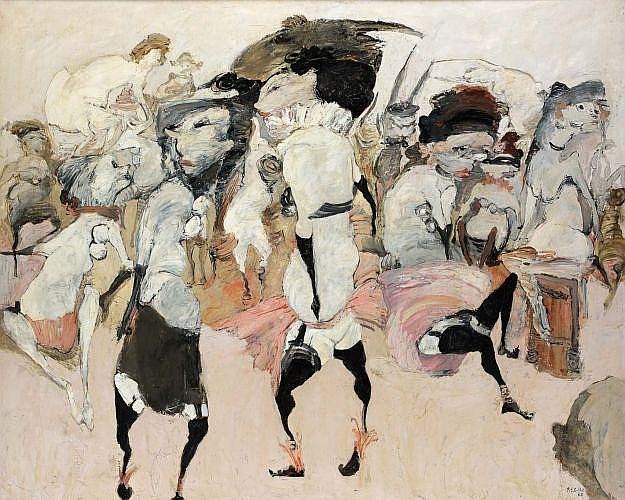 |
Roger Edgar GILLET (1924-2004) UNE SOIREE CHEZ POLLAC, 1968 Oil on canvas | Artcurial | 2011-10-25 | 71 | EUR 51,345 (buyer’s-premium treatment unknown) |
How these auction records were verified
Each row retains its exact source URL, lot identity, retrieval time, access result, and immutable record hash. Inspect the public comparable provenance record.
Disclosure: prices are shown as reported by auction houses and are provided for appraisal context. Learn more in our editorial policy.
A Print Made By Reliable Newark Of Soiree Musicale Et Dansante
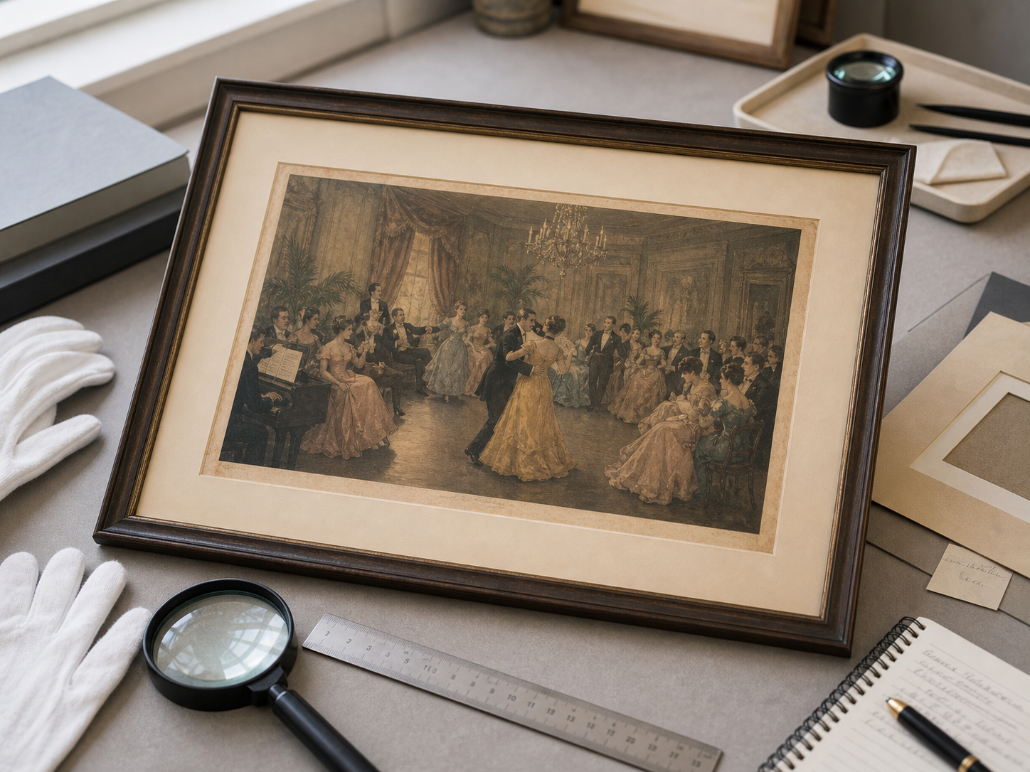
If you’ve come across a print bearing the French title “Soirée Musicale et Dansante” and a lower-margin credit to “Reliable Newark,” you may be holding a charming piece of American lithographic ephemera with Belle Époque flair. This guide explains what such a print is, how to identify the printer, how to date and authenticate the work, the condition factors that move value up or down, and how appraisers think about pricing.
Attribution and Context: “Reliable Newark” and Soiree Musicale et Dansante
- What you likely have: An event or advertising print—often a chromolithograph—celebrating or promoting a musical and dance evening (“Soirée Musicale et Dansante”) rendered in a late-19th to early-20th-century style.
- The printer: “Reliable Newark” typically refers to a Newark, New Jersey lithographic concern whose credit line can appear in several variants, for example:
- “Reliable, Newark, N.J.”
- “Reliable Litho., Newark, N.J.”
- “Reliable Lithograph Co., Newark” Printers in Newark were active in the period when chromolithography and early offset processes were common. Reliable-branded credits are encountered on posters, calendars, trade cards, labels, and event ephemera of broadly the 1890–1925 window. Precise founding and closure dates for each imprint variant can be elusive, so appraisers triangulate from paper, inks, typography, and subject matter.
- The language: French titles were fashionable in both Europe and America, suggesting sophistication. Even when printed for U.S. audiences, a French headline could evoke the Belle Époque. Some pieces were local event notices; others were generic stock images sold to venues or social clubs that added details later.
- Subject and style: Expect period attire, musical motifs (instruments, staff lines, garlands), and energetic dance imagery. The look may echo contemporaries inspired by Parisian poster art—think bright palettes, stylized figures, and large decorative lettering.
Dating and Technique: Stone Lithography vs. Later Reprints
The way the image was printed is the single best clue to age and originality.
- Chromolithography (c. 1860s–1910s):
- Each color was drawn on a separate stone (or zinc plate); colors were printed in succession.
- Under 10x magnification, you’ll see irregular crayon-like textures, overlapped color edges, and no regular halftone rosettes.
- Registration can be slightly imperfect, with delicate misalignments creating a lively, handmade look.
- Early offset lithography (c. 1900s–1930s):
- Uses halftone screens—dot patterns—to translate tones.
- Under magnification, you’ll see even dot grids or rosettes; however, the paper and inks may still feel “old.”
- Edges of letters and forms appear smoother than in stone litho.
- Later photomechanical reproductions (post-1950):
- Consistent rosette halftones across all colors, often at predictable screen frequencies.
- Bright white paper with optical brightening agents (OBAs) that fluoresce blue-white under a 365–385 nm UV torch.
- Modern pigments produce overly even, saturated hues compared to the layered depth of chromolithograph inks.
Other dating indicators:
- Paper: Antique wove papers typically present an ivory or cream cast; laid lines or watermarks can help. Machine-made papers with OBAs point to mid-20th century onward.
- Typography: If the piece has small event details added (date/place), check typographic style and printing method (letterpress or overprinted litho) for period consistency.
- Format: Surviving examples range from cabinet-card scale to one-sheet posters. Measure sheet size, not frame size, and note any trimming that removed margins or imprints.
Authentication: Physical Tells and Common Pitfalls
When appraisers authenticate a “Reliable Newark” Soirée print, they tend to work from the edges inward.
- Printer’s credit line:
- Locate “Reliable, Newark” (or variant) often at the lower margin, sometimes in tiny sans serif type.
- The credit was part of the lithographic stone; it should exhibit the same printing characteristics as the main image.
- Margins and trimming:
- Original margins are valuable. Many posters were trimmed for framing; if the printer credit is missing, look closely for residual letters or cut-off ink at the very edge.
- Poster mounting (linen-backing) may obscure or have removed marginal information. Check the verso or under a mat if safely possible.
- Lithographic characteristics:
- Loupe test: Look for litho crayon grain, color overlays, and the absence of a plate impression (lithographs do not have intaglio plate marks).
- Registration marks: Tiny guidelines or pinholes near corners can be original to the printing workflow.
- Ink and media:
- Chromolithographs often show slightly raised ink where heavy color was laid; colors can have a velvety matte surface.
- Later reproductions might have uniform glossy coatings or digital inkjet dot patterns visible under magnification.
- Paper aging:
- Natural toning, edge wear, and foxing can be expected but should be consistent with exposure and storage.
- Sharp, snow-white paper coupled with fluorescence under UV suggests modern stock.
- Additions and restorations:
- Overpainting: Under raking light, newer paint can appear as shiny patches or different surface texture.
- Bleaching and washing: A “too clean” sheet with residual tidelines at margins can indicate conservation—acceptable, but should be disclosed.
Common pitfalls:
- Facsimiles bound in later compilations: Some reprints of popular poster imagery were mass-produced mid-century; paper, halftone dots, and page binding holes can give them away.
- Digital prints masquerading as “lithos”: Uniform micro-droplet patterns and no press impression are red flags.
For this title, Reliable Newark and the print process matter more than the decorative subject alone. A modern reproduction should be compared with replacement-print retail, while a period chromolithograph or publisher-issued print needs paper, margins, color retention, publisher credit, and provenance checked against auction records for comparable music-and-dance lithographs.
Practical Checklist for Owners
- Identify the imprint: Find and photograph any “Reliable, Newark” credit and other marginal text.
- Measure correctly: Record image area and full sheet dimensions to the millimeter; note any trimming.
- Loupe the surface: Check for litho crayon grain versus halftone rosettes; scan text and flat color fields.
- Test with UV: Note any strong blue-white fluorescence (modern paper) or uneven restoration fluorescence.
- Assess condition systematically: List tears, folds, stains, losses, color fade, mounting method, and backing materials.
- Document provenance: Gather event ties, prior sales receipts, exhibition labels, or inscriptions.
- Avoid DIY fixes: Do not tape, wash, or press the print. If needed, obtain a conservator’s written treatment proposal.
- Research comparables: Compile realized prices for similar subject, period, size, and technique—not just asking prices.
- Seek an appraisal when warranted: For insurance, estate, or sale, a written appraisal grounded in current comparables is advised.
FAQ
Q: My print looks perfect white under room light. Is that a problem? A: Not necessarily, but if it glows bright blue under a UV torch, the paper likely contains optical brighteners, suggesting a later reproduction or modern paper replacement.
Q: I can’t find the “Reliable Newark” credit—does that mean it’s fake? A: Not always. Margins are often trimmed or hidden under mats or linen-backing. If safely possible, check beneath the mat or along the extreme edges for partial letters or ink. The printing method and paper will still tell a strong story.
Q: Do lithographs have plate marks? A: No. Plate marks are characteristic of intaglio processes (etching, engraving). Lithographs are planographic; you should not see a recessed plate impression around the image.
Q: Will linen-backing hurt my value? A: Professional linen-backing is accepted in the poster market and can aid preservation and display. Excessive trimming, over-cleaning, or heavy overpainting, however, can diminish value.
Q: How do I store it if I’m not framing? A: Keep it flat in an archival folder between acid-free boards in a dry, cool environment. Avoid rolling unless necessary; if rolled, use a large-diameter archival tube and interleave with acid-free tissue.
By focusing on printing technique, paper, margins, and condition—with the “Reliable Newark” imprint as a guiding clue—you can confidently place a “Soirée Musicale et Dansante” print in its historical context, assess authenticity, and approach appraisal with the same methodology used by professionals.