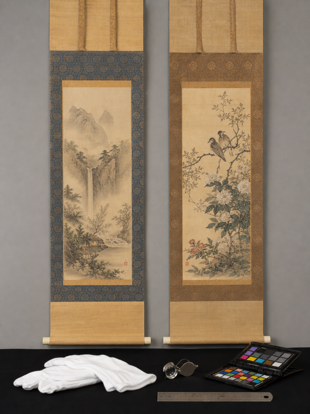
Note: We couldn’t find relevant auction comps in our database for this topic right now. If you’re valuing a specific item, try searching by maker/model/material and we’ll expand coverage over time.
What similar items actually sold for
To help ground this guide in real market activity, here are recent example auction comps from Appraisily’s internal database. These matched sales are market context only, not an object estimate or identification, and they do not guarantee a price for your specific a pair of original japanese circa early 20th.
Shown USD range: USD 250-USD 1,000. Median of these 4 USD examples: USD 562.50.
| Comparable | What sold | Auction house | Date | Lot | Source-reported amount |
|---|---|---|---|---|---|
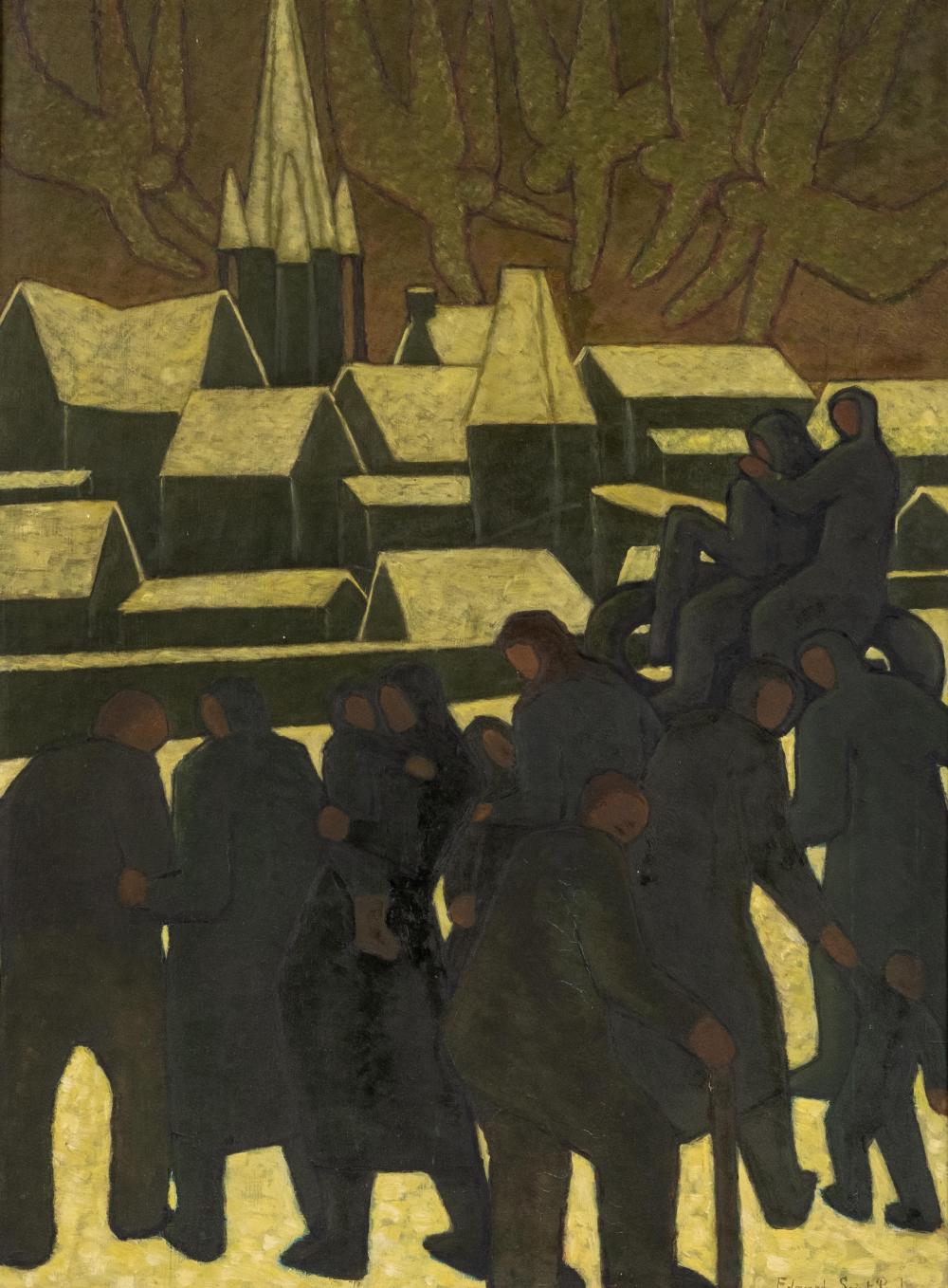 |
Edouard Saint Paul Signed Symbolist Oil on Canvas Painting, Early 20th Century | Collective Hudson, LLC | 2026-02-08 | 475 | USD 475 (buyer’s-premium treatment unknown) |
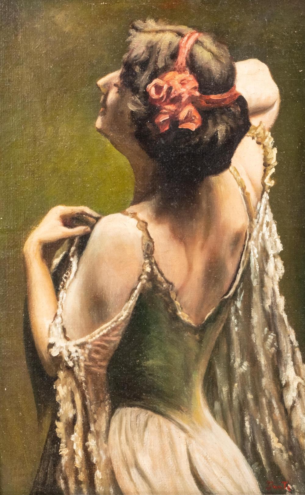 |
Early 20th Century Italian Oil on Canvas Painting | Collective Hudson, LLC | 2025-01-19 | 182 | USD 1,000 (buyer’s-premium treatment unknown) |
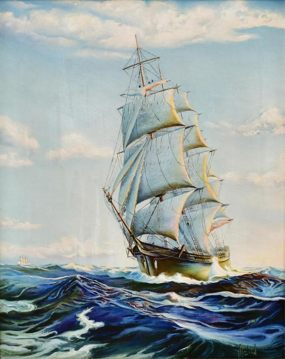 |
Mitchel Moisan, Sailing Ship Painting, Oil on Canvas, Early 20th Century | Fontaine's Auction Gallery | 2026-03-14 | 416 | USD 250 (buyer’s-premium treatment unknown) |
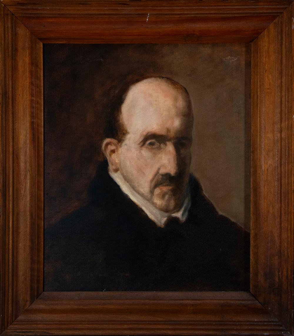 |
Oil painting on canvas portrait of Góngora late 19th century early 20th century | Templum Fine Art Auctions | 2025-09-09 | 1155 | EUR 500 (buyer’s-premium treatment unknown) |
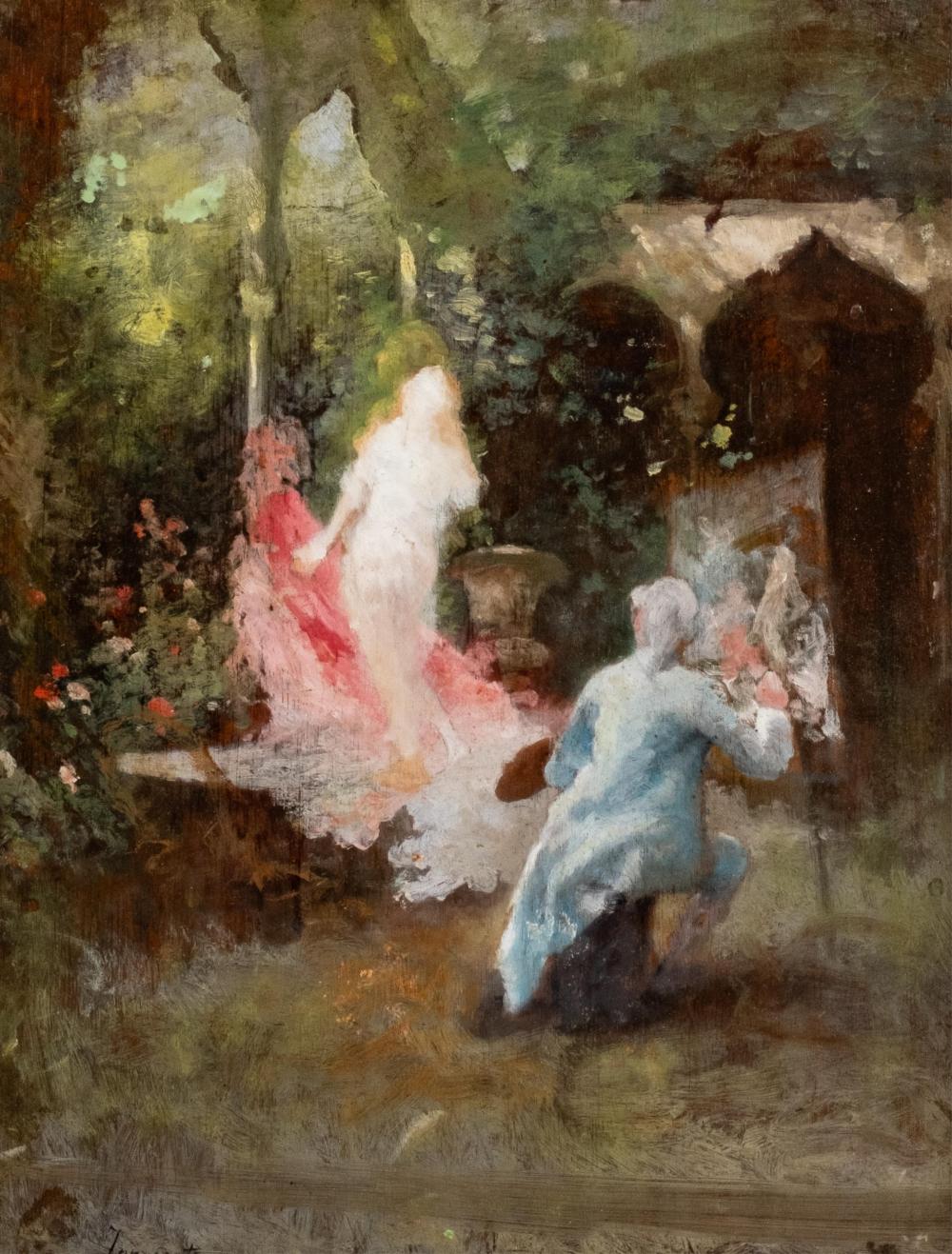 |
Camillo Innocenti Signed Impressionist Oil on Panel Painting, Early 20th Century | Collective Hudson, LLC | 2026-02-08 | 412 | USD 650 (buyer’s-premium treatment unknown) |
How these auction records were verified
Each row retains its exact source URL, lot identity, retrieval time, access result, and immutable record hash. Inspect the public comparable provenance record.
Disclosure: prices are shown as reported by auction houses and are provided for appraisal context. Learn more in our editorial policy.
Free instant estimate
Not sure if your painting is worth appraising? Let us take a look.
Upload a photo, tell us what you know, and get a free first read. If a full appraisal makes sense, we will say so.
Free. No card needed. Takes about two minutes.
A Pair Of Original Japanese Circa Early 20th Century Paintings
A matched pair of original Japanese paintings from the early 20th century often combines refined materials, sophisticated brushwork, and thoughtful pairing conventions rooted in centuries of practice. For appraisers and collectors, understanding the period context, reading signatures and dates, evaluating condition, and recognizing market drivers can turn a “beautiful pair of scrolls” into a well-supported appraisal with clear comparables and actionable recommendations.
Below is a structured guide focused on pairs attributed to the late Meiji, Taishō, or early Shōwa eras, roughly 1890s–1930s.
Period Context: Late Meiji to Early Shōwa (ca. 1890s–1930s)
- Transition in styles: The early 20th century in Japan saw two influential currents:
- Nihonga: “Japanese-style” painting using mineral pigments (iwa-enogu), ink (sumi), and traditional supports like silk or paper. Prominent schools and circles included Maruyama–Shijō, Kanō survivals, Rinpa revivals, and the growing mainstream of Nihonga guided by artists such as Hashimoto Gahō, Takeuchi Seihō, Uemura Shōen, Kawai Gyokudō, and Yamamoto Shunkyo.
- Yōga: Western-style painting using oil or watercolor naturalism, perspective, and chiaroscuro. Yōga occasionally appears in Japanese formats, but Nihonga dominates traditional scroll pairs.
- Patronage and exhibition culture: Works were created for domestic patrons, temple or tea settings, and increasingly for exhibition circuits (Bunten and its successors), with some export trade via curio dealers. Paired works were popular for alcove (tokonoma) display and seasonal rotation.
- Pair logic: Pairs could articulate seasonal harmonies (spring/autumn, morning/evening), complementary animals (crane/tortoise, hawk/heron), or landscape diptychs with a continuous composition. Matching textiles and rollers reinforced unity.
Understanding these currents helps place a pair stylistically and suggests likely schools and subjects without over-claiming authorship.
Formats, Materials, and Techniques
- Common formats for pairs:
- Hanging scrolls (kakejiku): The most encountered. Each scroll has the painting (honshi), top and bottom brocade (often gold-thread ichimonji), middle fabric (chūmawashi), a roller rod (jiku), and roller knobs.
- Framed paintings: Nihonga on silk or paper framed under glass—less traditional but seen in the early 20th century, especially in export contexts.
- Folding screens (byōbu): Pairs of two-panel or six-panel screens also exist, but scroll pairs are more typical for private collections today.
- Supports:
- Silk (most valued for refined Nihonga): Fine woven ground with visible silk sheen and grid. Older silk can show “silk burn” or embrittlement.
- Paper: Handmade washi; often sized with animal glue (nikawa). Good for literati ink-work (nanga) or soft mineral pigments.
- Pigments and binders:
- Iwa-enogu (mineral pigments): Ground azurite, malachite, cinnabar, etc., bound with animal glue. Shell white (gofun) from calcified shell often used for highlights.
- Sumi ink: Carbon-based, applied in layered washes for nuanced tone.
- Metals and effects: Gold or silver leaf (kinpaku, ginpaku), gold dust, and kirikane (cut-gold lines) in decorative passages; mica (kira) may be sprinkled for sparkle.
- Technical hallmarks:
- Tarashikomi: Pooled, layered ink/pigment associated with Rinpa revival effects.
- Bokashi: Graduated washes for mist and depth in landscape.
- Mokkotsu (“boneless”): Forms painted without outline, common in flower-and-bird (kachōga) motifs.
- Brushwork should show energy at starts and stops, tapering lines, and layered tonality under magnification—key in distinguishing painting from print.
Tip: Under a 10x loupe, look for raised pigment edges, animal-hair brush splitting, and subtle color layering rather than dot matrices or uniform halftones.
Signatures, Seals, and Dating Conventions
- Signatures:
- Many artists signed with a gō (art name) and a stylized monogram (kaō). Signatures may be in ink at the lower left or right, often accompanied by a red seal.
- Studio or collector seals may appear on the painting or mounting edge; these can be helpful but require caution in attribution.
- Seals (hanko):
- Typically red cinnabar stamps. They can be square, rectangular, or oval. Characters may be intaglio (white characters on red ground) or relief.
- Seals can denote the artist, studio, or collector; pairs often have matching or complementary seals.
- Date notations:
- Era name (nengō) plus year: e.g., “Taishō jūnen” (Taishō 10, i.e., 1921). Earlier Meiji-era works can be similarly noted.
- Sexagenary cycle (eto): A 60-year stem-branch combination (e.g., “kinoe-ne”) sometimes follows or replaces the era format.
- Seasonal or New Year dedications may appear, occasionally with a brief colophon describing the subject or occasion.
- Reading direction:
- Classical layout reads right-to-left. In a pair, the right scroll is often the “first” panel, with complementary action or inscription flowing toward the left scroll.
- Mounting labels:
- Some early 20th-century works bear dealer, framer, or export labels on the roller ends or storage box (tomobako). Tomobako inscriptions—artist’s hand or later brush inscriptions—can be crucial for attribution and dating.
Caveat: Seal charts are helpful, but many artists had multiple seals across their career. Cross-check seal forms with period-appropriate materials and style; a modern impression on aged paper is a red flag.
Subject Matter and Iconography in Pairs
- Landscapes (sansui):
- Continuous composition across two scrolls: waterfalls on the right, misted pines and pavilion on the left, for example. Boats traveling right-to-left imply narrative flow.
- Literati (nanga) influence shows in spare ink work, poetic inscriptions, and scholar’s retreats.
- Kachōga (birds-and-flowers):
- Seasonal pairings are common: plum and bush warbler (spring) matched with chrysanthemums and quail (autumn); peonies and butterflies paired with maple and deer.
- Shell white (gofun) may build volume in petals; fine-feather brushwork identifies quality.
- Figures and bijin-ga:
- Elegant women (bijin) in two contrasting scenes—morning/evening—echo seasonal balance. Mood often conveyed through textile patterns and posture rather than facial detail.
- Animals and auspicious sets:
- Crane/tortoise, hawk/heron, carp/lotus—reflect longevity, perseverance, or status. Gold accents often heighten the celebratory tone.
- Rinpa revival:
- Bold shapes, tarashikomi pooling, and lavish gold grounds suited to paired compositions; the symmetry between scrolls is intentional and decorative.
When assessing iconography, confirm that the pair is truly matched: same silk/paper type, congruent mounting fabric, identical roller style, proportional dimensions, and complementary subject logic. Mismatched mounts or different format proportions suggest later pairing.
A: Nihonga typically uses mineral pigments and ink on silk or washi, often with gold/silver embellishment, and is mounted as scrolls. Yōga adopts Western mediums (oil/watercolor) and perspective; early 20th-century Yōga pairs in scroll format are less common.Q: The seals look similar to a famous artist’s. Is that enough to attribute? A: No. Seals alone are insufficient. Compare quality, style, inscriptions, and era-appropriate materials, and look for corroborating documentation (tomobako inscription in the artist’s hand, exhibition records). Seek specialist opinion before making an attribution.
Q: One scroll is cleaner than the other. Does that hurt value? A: Yes, mismatched condition can reduce the pair’s appeal and price. If only one scroll needs conservation, ensure treatments preserve visual unity (matching brocade tone, sympathetic cleaning) so the pair reads as a set.
Q: Should I remount before selling? A: If the paintings are unstable (flaking, torn) or the mount is severely degraded, professional remounting improves stability and marketability. However, it is an investment—balance likely value uplift against conservation cost using recent comparables.
Q: Are there prints mounted as scrolls that mimic paintings? A: Yes. Some woodblock prints and collotypes were mounted as scrolls for export. Under magnification, prints show repeatable dot/line matrices and lack the varied brushwork and pigment relief found in hand-painted works.
A pair of original Japanese paintings from the early 20th century rewards careful looking: materials, technique, and pairing logic all carry information. By verifying medium and support, reading marks correctly, grading condition, and situating the works in their art-historical context, you can arrive at a confident appraisal—and a sound plan for preservation and, if desired, sale.