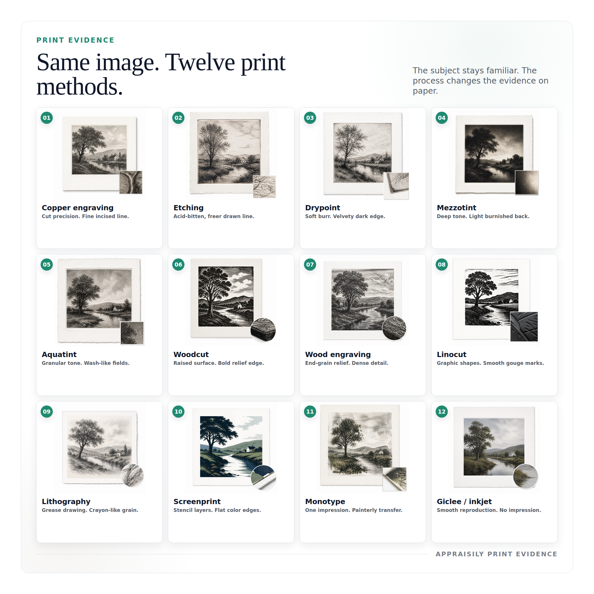
Printmaking Techniques Guide: Process, Marks and Value Clues
Identify printmaking techniques by documenting plate marks, paper, ink surface, dot patterns, edition details, signatures, inscriptions, condition, and provenance.
What this guide is based on
This guide uses visual process checks from printmaking references, internal comps data, and technical checklists used by Appraisily valuation staff. It is educational context, not a replacement for a full written appraisal report.
For pricing and sourcing standards, see our editorial policy.
Start with the method, not the seller story
The image may look “old” or “artsy,” but that does not tell you what it is. Start by mapping three technical layers in the first minute: line quality, pressure behavior, and paper response. If those three disagree with a claimed technique, the piece is now suspicious enough to pause and confirm.
The practical question is not whether the print is decorative. It is whether the printing process supports the claimed category and condition grade. Makers, edition structure, provenance, and wear on the original carrier usually move value more than style alone.
A quick reading also helps with direction. If the image has a consistent burr texture, a clear groove signature, and pressure marks on edges, you are probably in the intaglio family. If the image reads like a clean flat color block with stacked layers and no plate burr, you are likely in relief or stencil territory.
How to read line quality in one scan
Lines reveal the printing system first. Look for edge character: engraved lines usually hold a harder, precise edge that stays crisp under light tilt. Etching usually reads with more spontaneous variation. Drypoint often shows a soft fringe or velvety softness around the dark strokes because burr was intentionally preserved. In aquatint and mezzotint, value is in tonal fields rather than edge uniformity.
Use this rule: when a line looks mechanically perfect from edge to edge, you often face a high-control process or a modern digital transfer. That is not automatically bad, but it changes what “original” should mean for this object.
Pair this with print state context. If a gallery image shows multiple impressions from the same block with tiny line drift, you may have a relief method with consistent carve depth. If only this piece has those marks, verify whether it is a later pull or retouched.
Free instant estimate
Not sure what your print method is? Let us take a look.
Upload a photo, tell us what you know, and get a free first read. If it is worth a full review, we will say so.
Free. No card needed. Takes about two minutes.
Turn surface behavior into a decision tree
Prints are easier than people think when you reduce to three checks: does the surface push back under light, does the edge of the pigment break cleanly, and does paper show compression. The answer to these three tells you whether to look for intaglio, relief, or planographic systems first.
For buyers and owners, this matters because buyers price technical fit. Same subject, same subject size, different method can mean a major value spread. A modern-looking surface with perfect registration might still be collectible as a process print, but it usually implies different demand dynamics than a hand-burnished intaglio original.
Use your photos with raking light and a close crop. If you cannot see consistent texture and edge behavior, move photos to a larger size before concluding anything about authenticity.
Check copper engraving clues first
Copper engraving is a controlled incised process. Expect clean, firm lines with crosshatching that feels engineered. Reproductions often flatten this structure because plates are copied by photography or transfer media.
Look for line depth consistency and tiny chip direction in dark transitions. You should see a deliberate rhythm in the grooves. In a true engraved original, edge character usually changes slightly with hand pressure. If all lines appear cloned from a single digital source, the copy risk rises.
Map etching feel in the darker passages
Etching usually shows a freer line system. Acid biting produces irregular edge character and subtle micro-texture in the drawn lines. If an image looks clean in flat studio lighting but reveals micro-vibrations when enlarged, this can support an etching profile.
Etching signatures can fade from time and restoration, so you cannot rely on signature placement alone. Confirm the line behavior across highlights and mid-tones before assuming the method.
Find drypoint burr by touching only your eyes
Drypoint is where burr matters. You should see soft, rich line edges that feel slightly fuzzy or velvety. The first print from a burr-rich plate often has deeper density; later impressions can weaken as burr breaks down.
If all dark marks in your image look equally hard and mechanical, burr signal may be low. That does not make it fake by itself, but it moves the item toward a different method assumption.
Read mezzotint as tone, not line
Mezzotint is tonal first. Edges can look smooth and smoky, with transitions built from ground grain rather than line drawing. In good pieces, darks have depth and the transition to light is gradual, not abrupt.
Comps across auctions often show why condition matters here. Surface abrasion or repeated pressing reduces tone control more quickly than simple ink age. If tones look chalky and flat in an image claimed as mezzotint, ask for higher resolution photos of highlights and edges.
Separate aquatint grain from printed wash
Aquatint imitates wash-like areas by grain exposure. You should see tonal modulation that feels granular at microscopic scale. If the grain is absent and only large flat areas remain, then either the plate is heavily worn or the image is likely a later process.
The most common confusion is confusing aquatint with lithographic crayon rendering. On a good check, compare how hard light breaks across the same mid-tone area in two images. Aquatint usually keeps a slightly irregular grain in dark-to-mid transitions.
Check woodcut edge geometry in high-contrast areas
Woodcut is relief on opposite logic to intaglio. Look for bold, cut-formed edges and strong contrast blocks. The image often has a carved rhythm and visible tool decisions in negative space.
False claims often appear when modern block prints are sold as hand-carved work. In those cases, edge microstructure lacks the inconsistency from tool feed and pressure variation. A close edge scan can catch this fast.
Use line density to verify wood engraving
Wood engraving behaves finer than woodcut. The grain structure should hold fine linear detail from end-grain carving. You often see controlled hatching and tighter negative spaces compared with woodcut’s blockier forms.
When the method is presented as wood engraving, but line fields look too soft or too even, you may have a digitally processed image in a traditional label. That is not always a problem, but it changes value and rarity assumptions.
Confirm linocut as simplified carved expression
Linocut favors simplified forms and cleaner edges. Compared with wood engraving, textures are usually less granular and more graphic. You will often see clear silhouettes and broad flats that are intentionally declarative.
If those forms look too painterly or too smooth, ask for paper and reverse-side photos. Linocut plates can wear, but they usually keep edge personality even in later pulls.
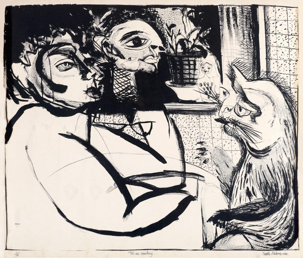
Identify lithography with crayon-like draw logic
Lithography is planar and often reads like a drawn process. You may see soft transitions and tonal areas that sit between line and wash, without clear incision edges. Surface is often less physically impressed than intaglio.
The practical signal is how the ink sits: lithographic marks can look smoother and more spontaneous. If the entire image has a transfer-like flatness, validate edition labels and provenance before confirming method.
Evaluate screenprint layering and ink stacks
Screenprint is layered by stencils and ink passes. In photos, look for flat color fields, hard separations, and clean registration. The strongest examples show controlled ink density with minimal edge drift.
Modern screen systems can be very clean. That is why you need edition context, paper quality, and print state as equal checkpoints. Without those, a beautiful color print can be overpromoted or mis-described.
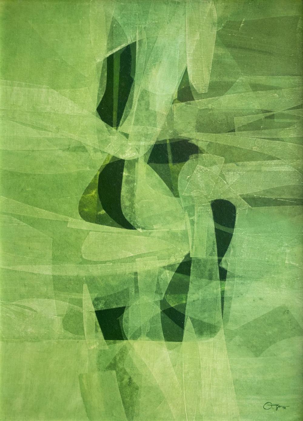
Interpret monotype as unique print behavior
Monotype is often one-off by design. The image may look painterly, with smooth transitions and ink movement that does not repeat exactly across pulls. If multiple nearly identical impressions exist, it is less likely to be monotype.
On value, this means each monotype should be treated as a singular outcome. Buyers compare fewer references, so edition confusion is less likely but condition sensitivity is high.
Separate original print systems from giclée or inkjet output
Giclee and inkjet reproductions often read with smooth continuity and dot structure under close crop. That is normal for digital output, but it is a different object class than classic printmaking when buyers evaluate process and scarcity.
The ethical issue is not that this is automatically less interesting, but that method affects pricing models. A giclée on archival stock can be excellent reproductions for display, yet it usually follows different valuation rules than hand-produced print methods.
Use method, maker, and paper to anchor value assumptions
Method clues are only the first half of a valuation answer. The second half is market context: artist recognition, edition size, paper and state, and clear provenance chain. Buyers pay for credible evidence, not for method labels alone.
That is where your auction comps matter. Similar objects can cluster by method first, then spread by condition and signature confidence. If two prints share method and size but diverge in paper and print state, valuation differences can be large. This is why the table below is a practical checkpoint before any offer conversation.
When you see a plausible match in the comps, treat it as directional guidance. If the match is weak, pause and request a specialist read.
What similar items actually sold for
To help ground this guide in real market activity, here are recent example auction comps from Appraisily’s internal database. These are educational comparables (not a guarantee of price for your specific item).
Disclosure: prices are shown as reported by auction houses and are provided for appraisal context. Learn more in our editorial policy.
Quick identity checks before you message us
- Confirm method consistency in line, ink, and paper response.
- Validate maker, title, and signature with edition context.
- Map condition and wear against comparable sales before assuming rarity.
- If any signal conflicts, ask for a specialist review before pricing decisions.
If these checks are still unclear, upload photos and ask for a free first read.
References and research notes
Search variations readers ask
Use these when you are checking a specific kind of print:
- how to tell if a print is an original etching or reproduction
- how to identify copper engraving prints by line and plate marks
- how to tell lithography from screenprint at home
- how to check if a print is monotype or offset photo print
- how to verify printmaking signatures and edition numbers
- what paper details indicate older print technique
- does ink texture change between woodcut and linocut prints
- printmaking method clues before buying unknown vintage prints
- value factors for signed artist prints and image states
- how to tell a real etching from a digital print
Not ready to invest on your own?
Get a free instant estimate now.
Upload photos and answer a few fields. Free. No card needed.
Get my free estimateChoose your next step
Use the path that matches the decision you need to make about the item.
Need a signed report?
Use this for insurance, estate, donation, resale, or documented value decisions.
Start a signed reportNot sure it is worth appraising?
Start with a lower-friction screen to understand the likely category, evidence, and next step.
Use the free screenerNeed local or specialist help?
Compare directory options when the work needs in-person review or a specialist near you.
Find art appraisersSee what the report looks like
Sample reports show how photos, comparable evidence, condition notes, and a value conclusion are documented.