You might think medium is the finish line. It is not. The practical question is whether the visible surface behavior matches the piece’s story and condition. In this guide, we compare 12 mediums using the same still life scene so you can read differences quickly: opacity, sheen, paper tooth, brush and tool marks, and support behavior.
The supplied images are generated visual examples of the same still life translated across media. They are for comparison and education, not historical objects and not auction records. That distinction matters because value depends on artist context, attribution, originality, size, provenance, documentation, condition, subject, and market evidence.
Use this 12-part quick check before you decide next steps
- Identify support: stretched canvas, paper type, panel, or plaster.
- Check surface: matte, satin, gloss, bloom, craquelure, lift, or tooth.
- Look at line quality: confident stroke, broken edges, stipple, hatch, or powder buildup.
- Test edge behavior: lifting, flaking, pigment migration, or brittle glaze.
- Assess provenance and documentation before relying on any visual guess.
- Compare with reliable removed comparison tables and market context.
- Escalate to a free instant estimate if you need a first-read before spending on formal appraisal.
Editorial method and evidence handling
This guide is a public education piece, and valuation calls are not pre-committed. Signals are grouped by medium, then re-tested through condition, provenance, attribution, and comparable outcomes.
Auction references are for context, and final pricing decisions require source photos, item-level inspection, and documented context.
Think your item might be worth something? Upload a photo and get a first read.
The free instant estimate path is best for first-pass triage. No card is needed. If your images show strong attribution signals and sound condition, we can keep moving.
Free instant estimate
Not sure what this artwork is made of? Let us take a look.
Upload a photo, tell us what you know, and get a free first read. If it is worth a full appraisal, we will say so.
Free. No card needed. Takes about two minutes.
1) Oil painting
Oil usually gives the most obvious depth: opaque passages, flexible blending, and visible layering. You should expect controlled edge variation where the brush drags into wet-under-wet transitions. A strong oil surface often shows a subtle sheen from fat-over-lean layering and occasional micro-cracking in old works. In valuation checks, opacity and glaze depth are useful only once support and condition are confirmed, especially along stretcher edges.
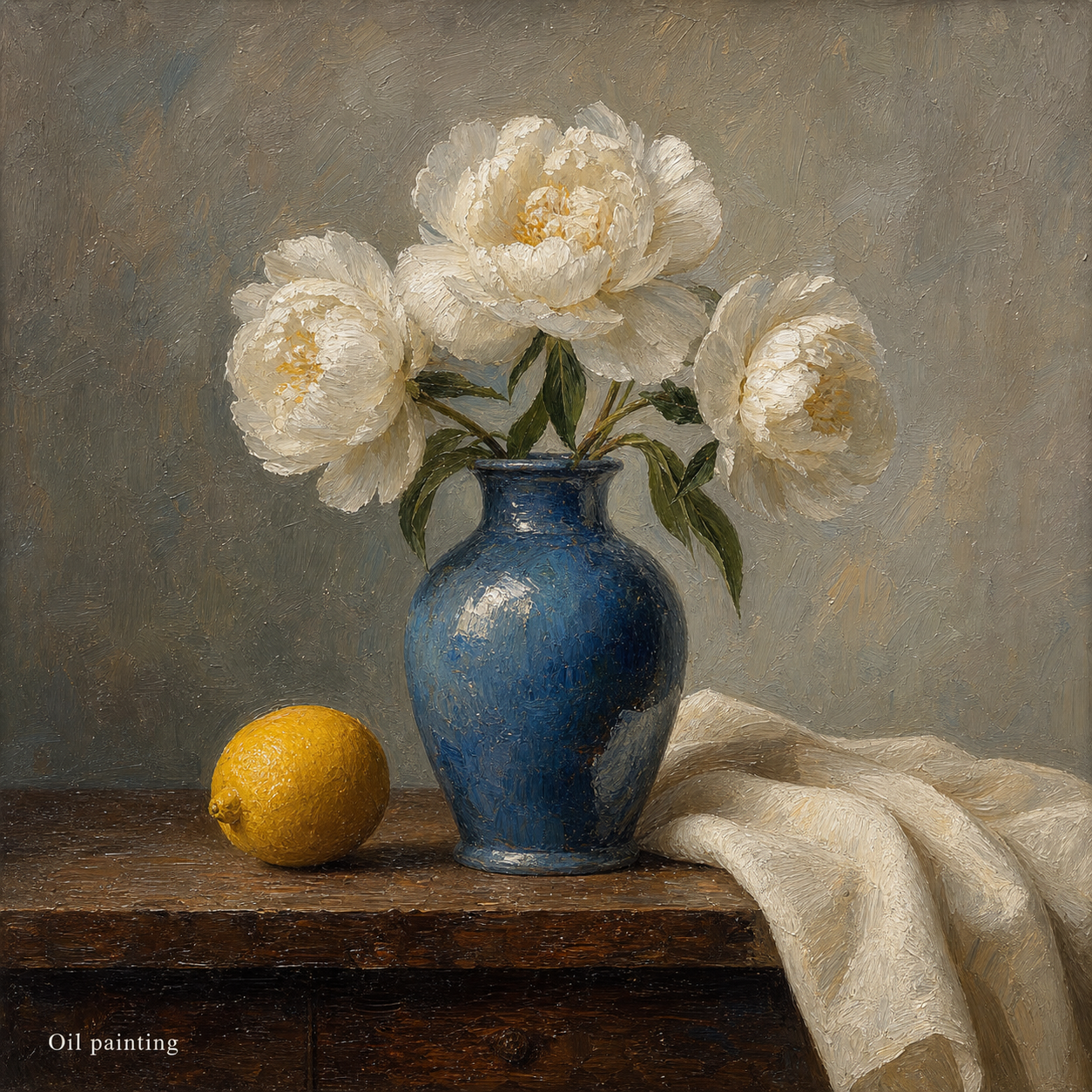
Value guardrail: brittle craquelure near high-contrast transitions or darkened varnish may lower confidence faster than the subject itself.
2) Acrylic painting
Acrylic usually dries faster and flatter than oil. The key clue is edge control in earlier-to-later layers, where coverage feels denser and less warm in open highlights. In hand-made scenes, acrylic can look polished while remaining relatively hard on the surface. You can often see fast-drying corrections with tighter shape boundaries.
Condition note: UV darkening is less about value than structural adhesion. Flaking, matte islands, and brush drag marks are the triage clues to capture.
3) Watercolor
Watercolor is transparent by default. Look for reserved whites that stay open, soft blooms, and visible tooth in the paper. Pigment tends to move with water, so edges can be feathered naturally rather than fully blocked. The surface is generally lighter and less physically heavy than oils and acrylics.
Appraisal lens: humidity damage and paper buckling can be bigger value risks than pigment type.
4) Gouache
Gouache looks like watercolor but sits more opaque and smoother. You often see deliberate correction zones because it can be lifted and reworked quickly. Dense color blocks and matte fields are typical. If the highlight planes have abrupt transitions, they may be hand-corrected.
Value guardrail: matte does not mean low quality. It means inspect edge wear and binder saturation where repeated handling occurred.
5) Tempera
Tempera often shows dry, matte precision with fine strokes and controlled shading. You can notice a brittle feel at line intersections and a luminous surface without soft glow. It often feels less forgiving than modern acrylic in terms of correction.
Condition signal: flaking and powder residue around brush transitions matter more than color depth in this medium.
6) Pastel
Pastel behavior is visible in matte, powdery transitions and the way color lifts or smudges. You will often see broken color fields and soft edges. The paper tooth is crucial; it grabs pigment and can wear in zones with repeated touch.
Fragility checkpoint: fingermarks, bloom-like smears, and edge lightening are often the first signs of value-impacting wear.
7) Charcoal drawing
Charcoal produces broad tonal masses quickly. Look for strong smoke-like transitions, deep matte black, and smudge depth. Highlights are created through lift, not bright pigment. Good examples keep edges stable while allowing soft passovers.
Condition watch: any surface bloom, uneven fixation, or active smudging that expands over time is a practical risk marker.
8) Graphite
Graphite is precision. The line map and hatch rhythm are usually deliberate, with reflective sheen in concentrated tones. In good drawings, you see deliberate grading, not random scuffing.
Value lens: smudged highlights, heavy ghost lines, and paper distortion from over-pressing usually lower confidence before attribution review.
9) Ink drawing
Ink is line-first. Clearness of contour and edge consistency should stay stable through contrast shifts. Look for stippling, crosshatching, or dry-brush-like breaks where water contact changed drying behavior.
Condition risk: feathered lines and bleed-through should be read as handling/aging signals, not necessarily defects unless severe.
10) Colored pencil
Colored pencil delivers controlled layering, especially in controlled pressure and burnished zones. You’ll often find smooth transitions with slight pigment grain. Distinguish normal pencil layering from heavy pressure marks that flatten form.
Condition risk: surface lift and color transfer are common in improperly stored works.
11) Collage and mixed media
Collage pieces reveal material stacking: paper boundaries, cut marks, torn edges, and material overlaps. Each layer carries a different aging behavior, so one medium clue is often not enough. A mixed-media appraisal depends on the strongest intact layer and the weakest damaged layer together.
Market signal: because structure is complex, two works with similar visuals can differ dramatically depending on substrate integrity.
12) Fresco and wall painting studies
Fresco-like studies show mineral pigment bound into a plaster-like skin. Surface transitions are often flat and absorbent, with edge seams where support transitions happen. Even in a small wall-style panel, look for consistent adhesion and even absorption.
Condition guardrail: micro-flaking and lime separation are critical risks here, often more significant than minor color deviation.
Turn medium clues into an actionable valuation plan
Medium helps you narrow possibilities. It does not replace provenance, maker, or condition history. If you are deciding whether an item is worth a written appraisal, combine three checks:
- Evidence: photographs of edges, verso, back, and frame or support joins.
- Market frame: compare with nearby market evidence in the same media class and era.
- Specialist triage: use a free estimate to validate whether the clues are enough for a stronger written route.
When confidence is low, that is not failure; it is the moment to collect better images and records. If the same object can move in two directions from one photo, you need one more reliable data point before a number can feel meaningful.
Get a free instant estimate now
Upload photos and tell us what you can verify. We guide you to a fast first read.
Get my free estimateSearch variations people ask
- How to tell oil painting from acrylic in photos
- How to check if a painting is watercolor or gouache
- What does broken pastel paper tooth mean
- How to spot paper burn-in or lifting from pastels
- Does graphite drawing value change with paper support
- How to identify mixed media for appraisal risk
- How to tell charcoal from black ink in vintage works
- Fresco-like surface clues on wall paintings
- What medium signs matter most before appraising art
References
Use these as context, not as a price substitute.
FAQ
If the medium is mixed media, should I still use this guide?
Yes. Mixed media often needs the most deliberate sectioning: support, edges, and repair history, then a higher-touch review if signals conflict.
Can I price a piece without provenance?
You can form a narrow lane, but it is usually incomplete. Provenance and maker details are the difference between a rough range and an opinionated value.
Do I need to submit photos before starting?
For a practical first read, photos are the fastest way to reduce uncertainty. You can start with a clear front shot and add closeups of edges and reverse.